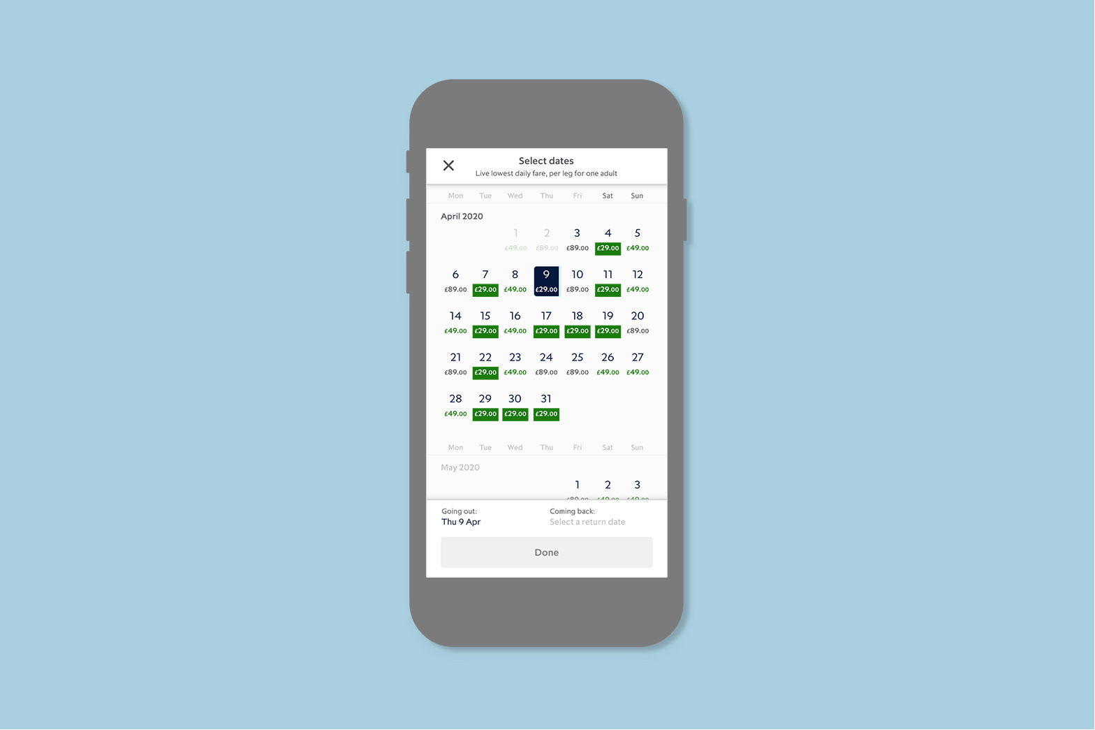
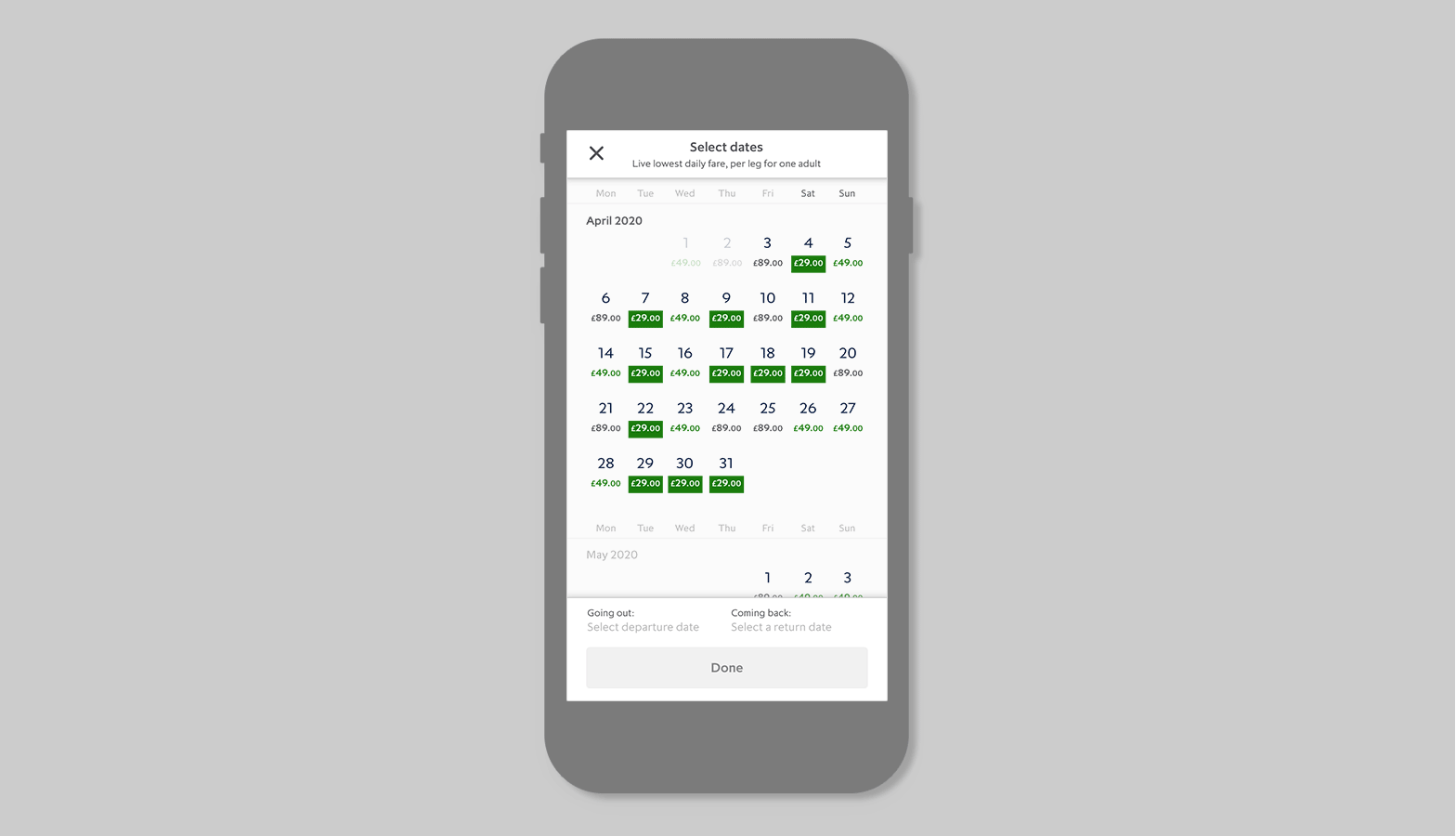
Eurostar pricing calendar and booking map view
The objective of displaying prices in the calendar is to create a user-friendly experience by helping users quickly find fares within their budget. This feature enhances pricing transparency and builds trust, while simplifying decision-making to reduce friction. By meeting user needs and improving usability, it ultimately aims to drive higher conversion rates.
Key Learnings from User Testing
User testing revealed that Eurostar is widely perceived as expensive, with users rating this perception 4/5. Some noted that the price difference with flights can be as little as £20, making it less appealing for leisure travel: "I personally wouldn’t use Eurostar... I use price comparison sites for flying." Others emphasized flexibility, stating that "price is more important than dates." However, business travelers prioritized service, convenience, and app functionality over cost, with one user noting, "I use Eurostar for work; price isn’t important." These insights highlight a clear divide between leisure users, who are highly price-sensitive, and business users, who value convenience and service.
Objectives
The objectives from the user testing insights focus on refining how prices are shown in the calendar. Key goals include understanding how to display price indications effectively and whether users view Eurostar as expensive or offering value for money after seeing the lowest daily fares. The design aims to create cognitive dissonance by challenging users' price expectations. Prototypes with actual, relevant prices will be developed and tested, highlighting the cheapest fares, while clarifying whether they represent the lowest or average price of the day. Multiple versions will be iterated and tested for clarity and usability.
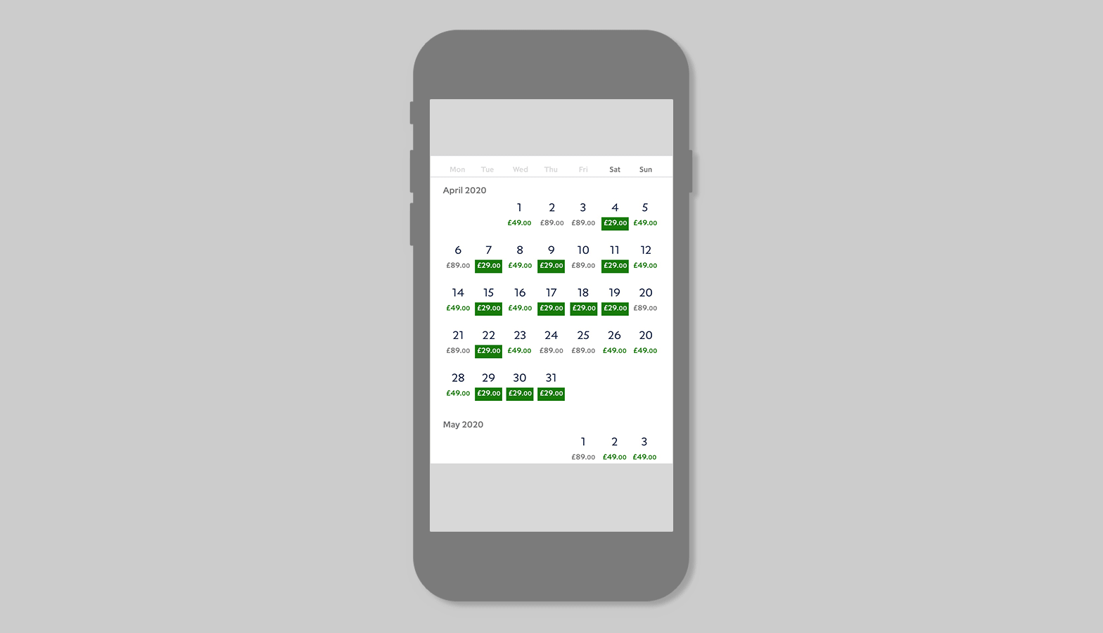
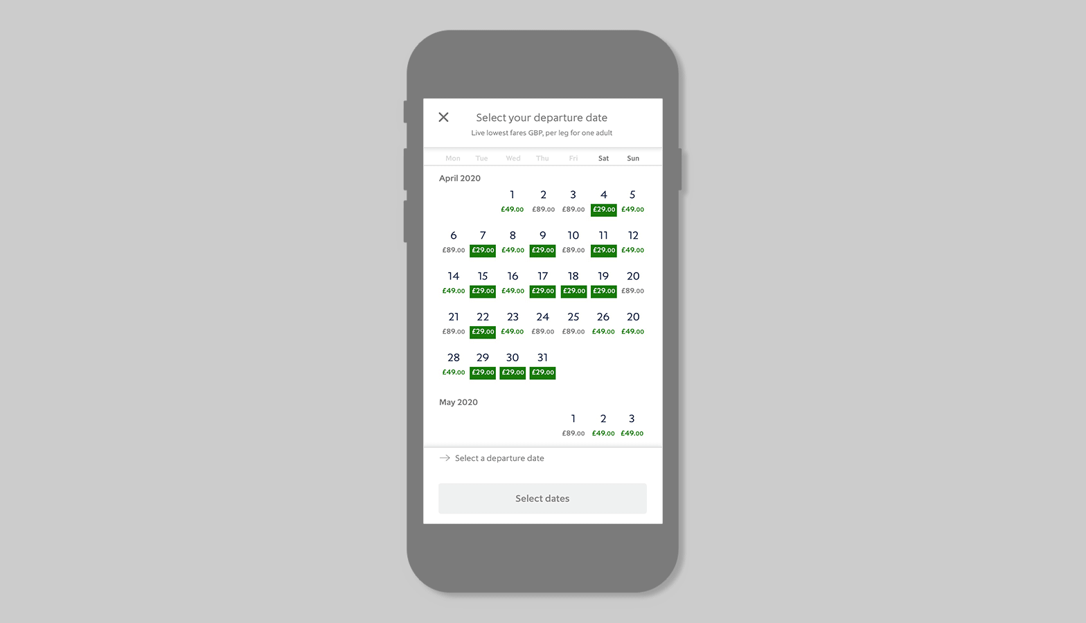
The Calendar
The design objectives are to surface price information, clearly communicate normal, low, and lowest prices, highlight weekend days, create a finger-friendly design for touchscreens, and achieve an accessibility rating of AA+.
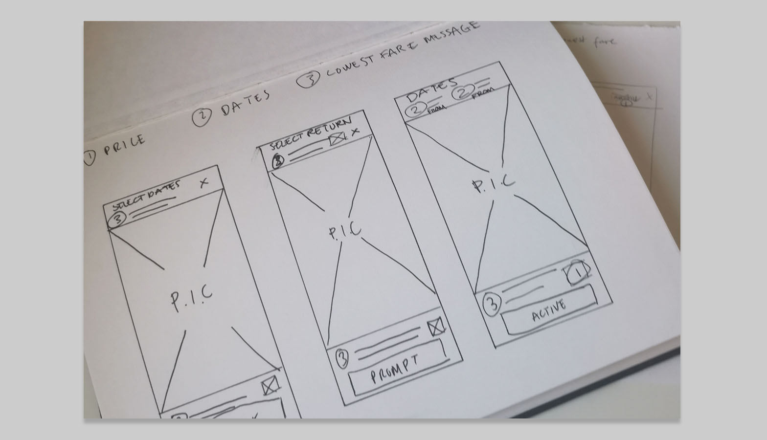
Prototyping and testing frames
The three key parameters are price, date, and lowest price messaging. User testing was conducted online with 10 regular Eurostar site users and 10 non-Eurostar site users.
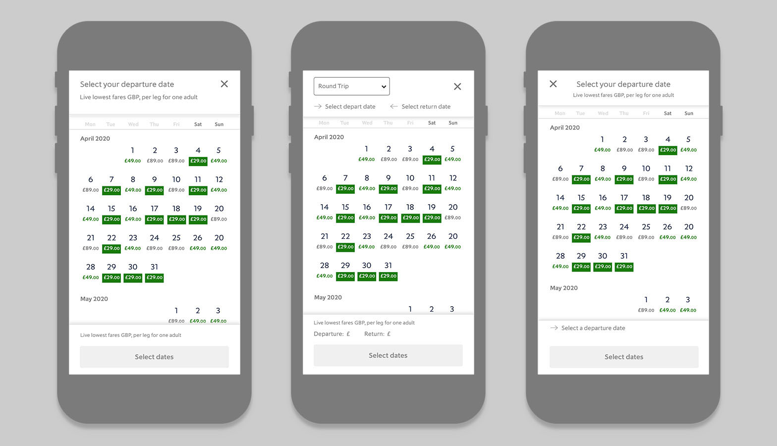
Frame 1 testing
Key user feedback includes: "Maybe make the frame slightly larger as my parents would struggle to read this," "Arrow is confusing; I know it means outbound and inbound but is hard to understand at first," "Is the total price a 'from' price or actual total? This is confusing," "How do I go back and select just one way?" "Pricing and dates much clearer," and "Seems busy with 3 tiers of information."

Frame 2 testing
Key user feedback includes: "I don't need to see the date twice," "What do arrows mean? Not clear," "It was very easy to find the cheapest return from London to Paris. The only flaw I can see is there are no times displayed," "Clean looking and easy to use," "I like the depth of the frame," "Easy to read," "Do I need the date twice?" "Could be clearer what month and day we are on," and "Easy to switch between round trip and one way."
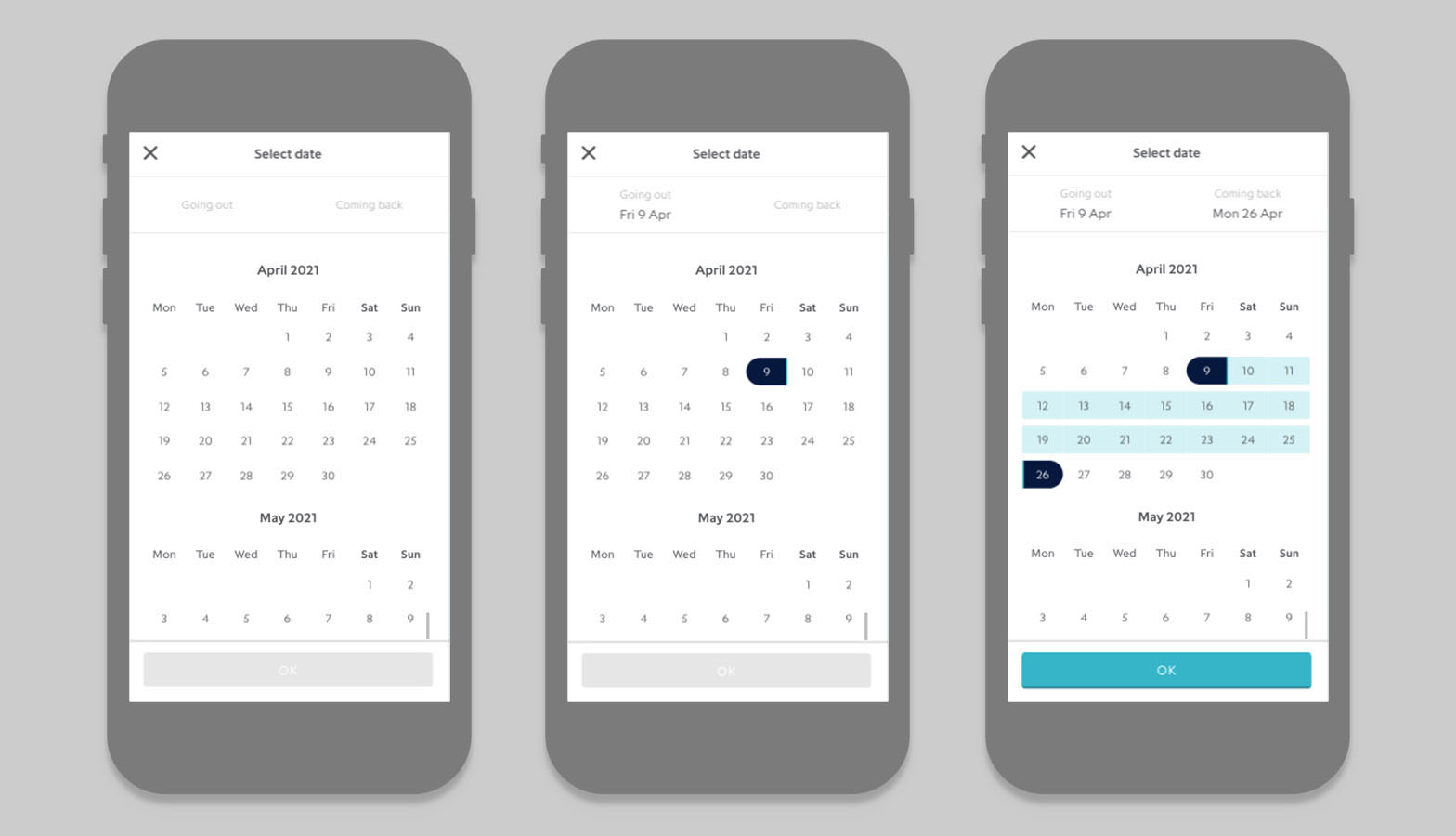
Final outcome
The final outcome is a user-friendly design with a simple interface that makes information easy to view at a glance, improvements were made to clarifying the return trip selection, while the clear button and helpful prompt enhance overall usability.
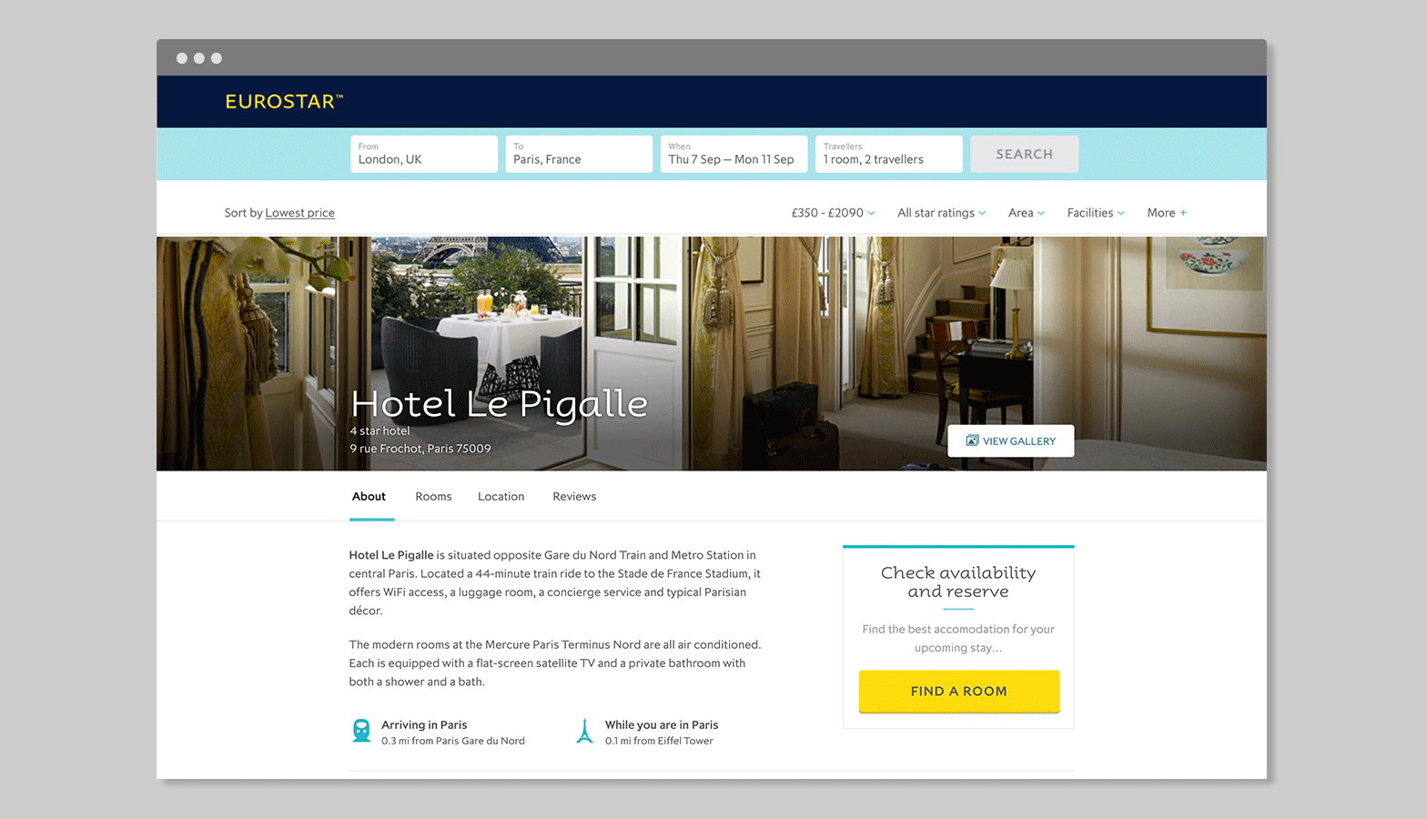
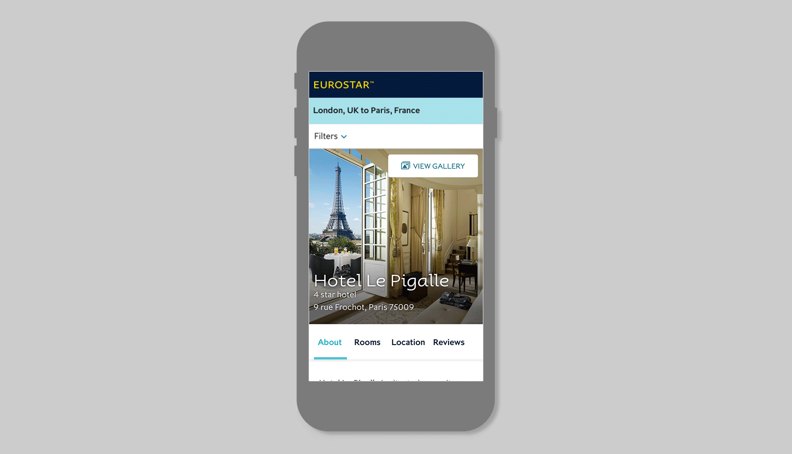
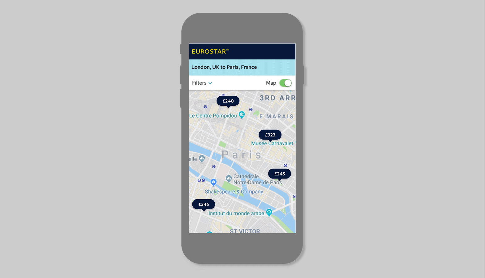
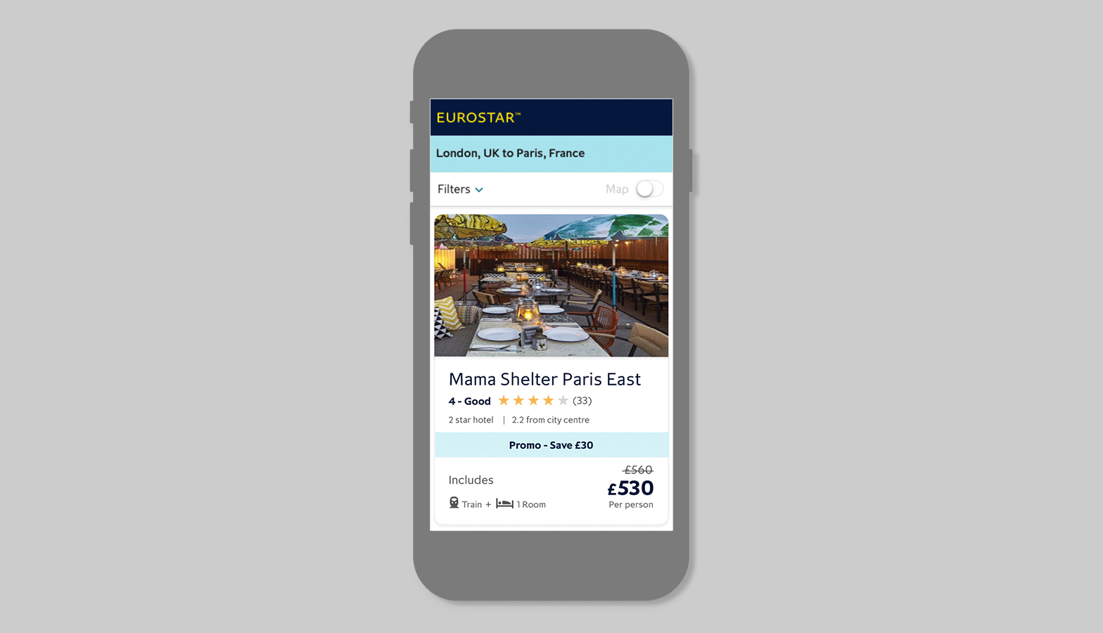
Map and List View for Eurostar
This feature introduces a Map and List view, enabling users to easily connect locations with pricing for a more informed decision-making process. It also enhances the clarity of hotel information by clearly distinguishing between star ratings and customer reviews, ensuring a seamless and transparent booking experience.
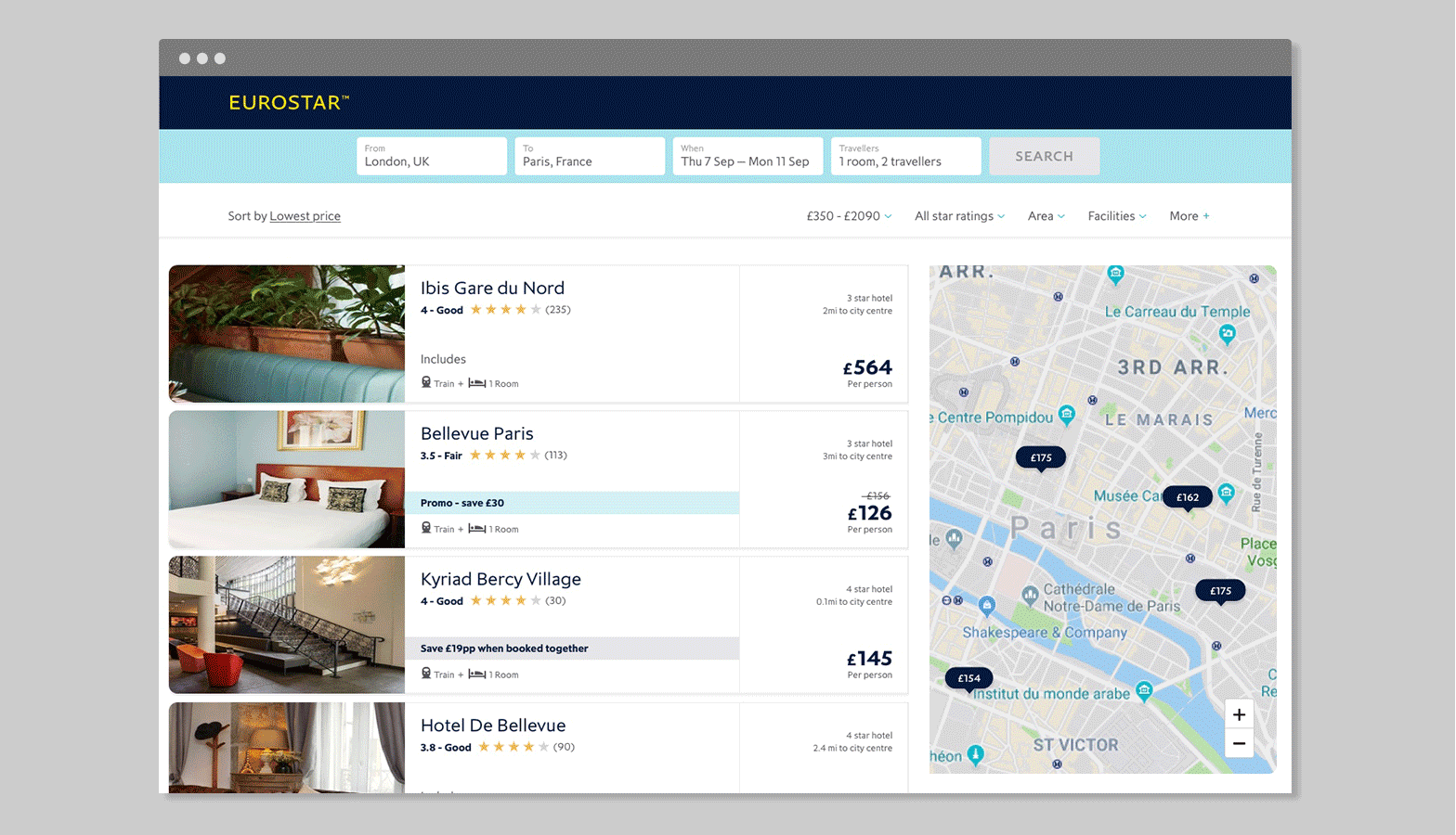
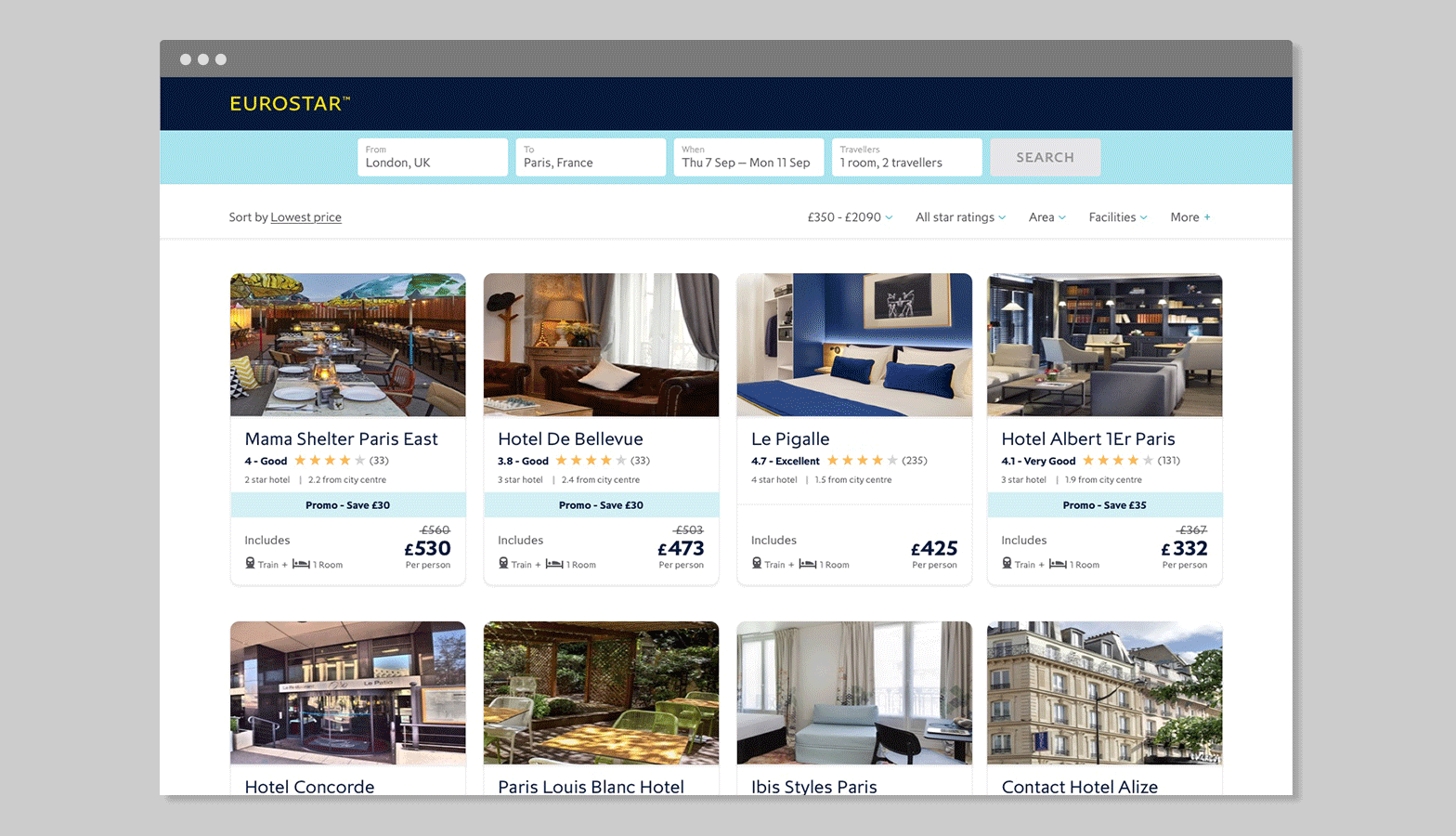
Hotel Card Redesign
The redesign aims to establish a clearer hierarchy of information and create cleaner, more streamlined listing pages. It will also highlight user reviews as a key feature, helping users make better-informed decisions. Additionally, the visibility and clarity of potential savings will be improved to further guide users in making more confident choices.
Reviews
The goal is to integrate reviews into the hotel details page and surface them on the about page to enhance user experience. By prominently featuring reviews, we aim to gain customer trust and ultimately improve the conversion rate.