Sedex's SAQ: A Collaborative Approach with Members and Staff

Project Title

I was brought in to help reimagine Sedex’s Self-Assessment Questionnaire (SAQ), a critical tool for supply chain transparency, used by thousands of suppliers. With over 400 questions, the SAQ was seen as high-friction. Only 40% of new suppliers completed it, which meant buyers weren’t getting the data they needed. We set a target: 80% completion for 95% of SAQs within 12 weeks.

I was the sole product designer working alongside a dedicated PM and Tech lead.

Research UX Figma User testing Zoom

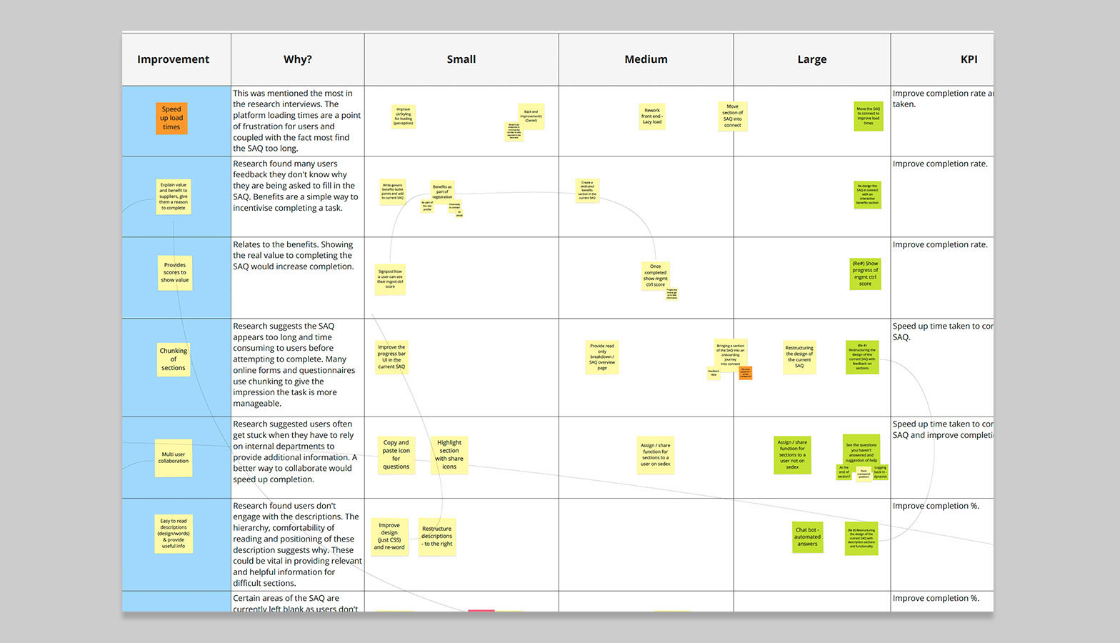
Discovery: Understanding the problem

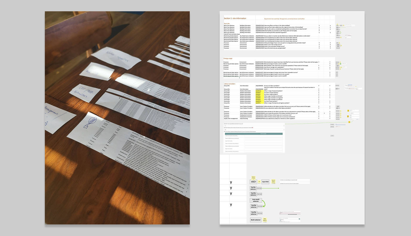
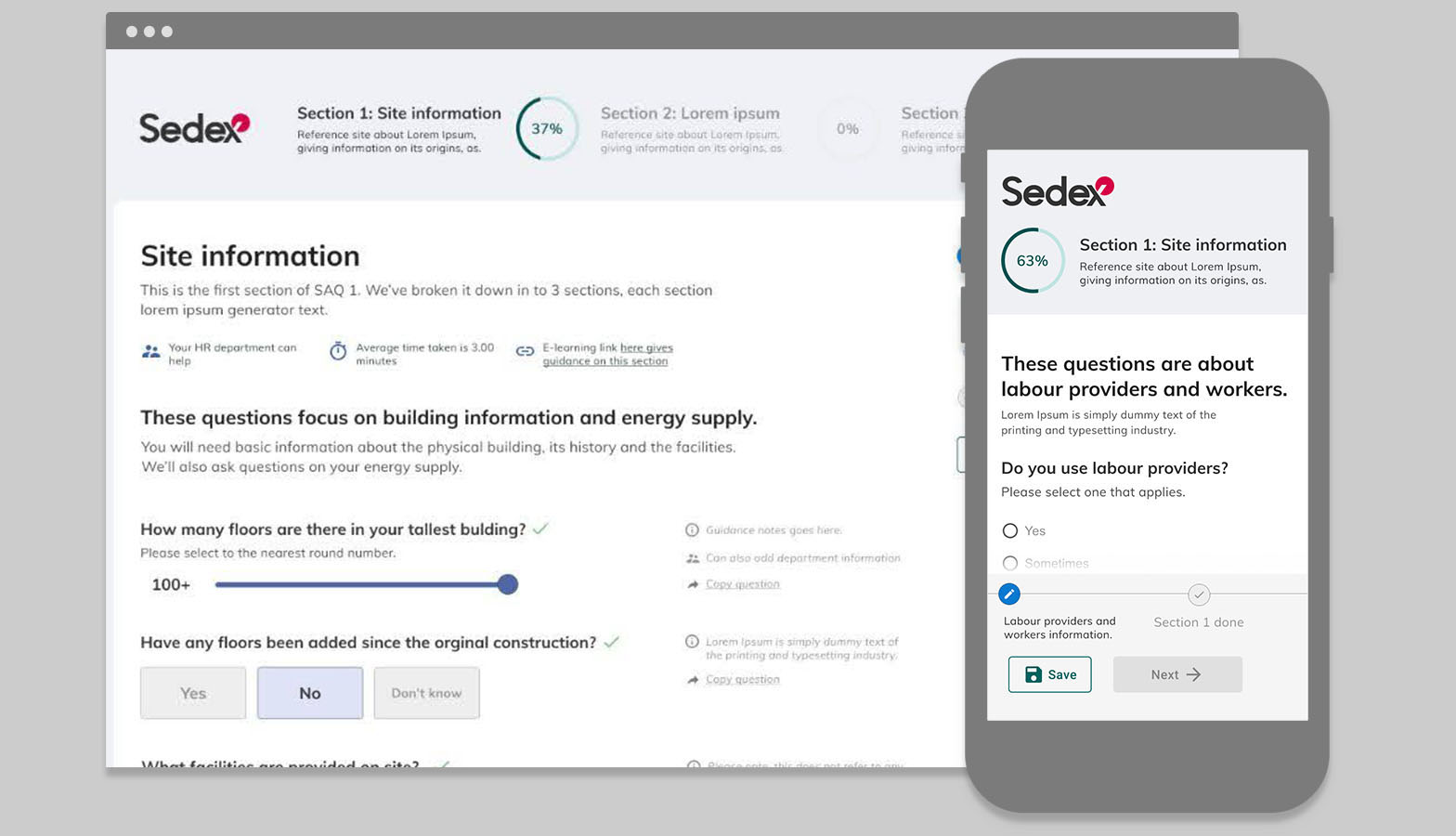
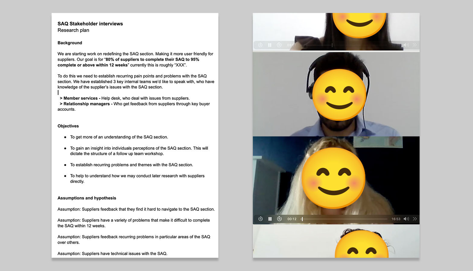
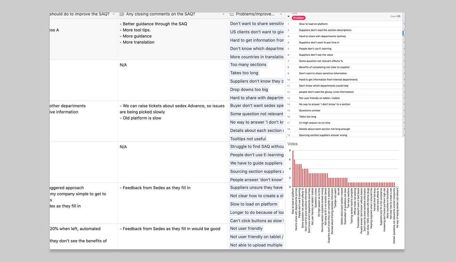
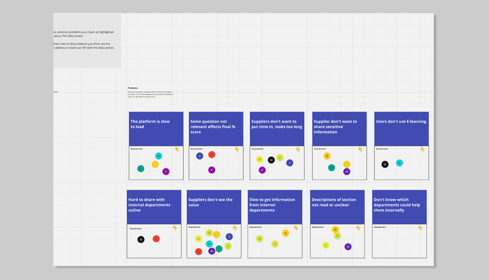
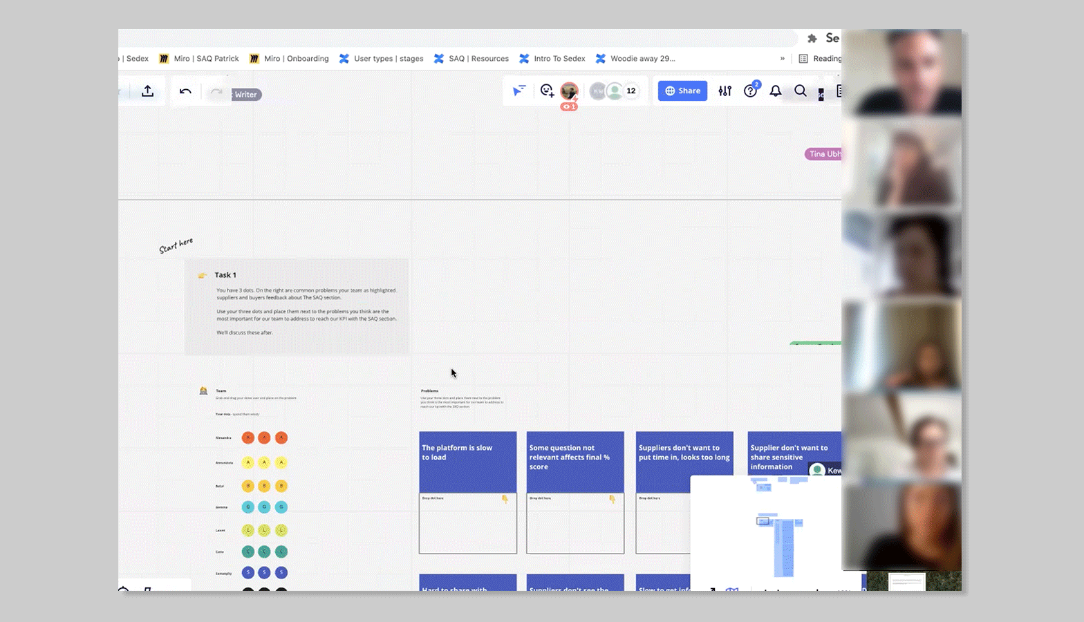
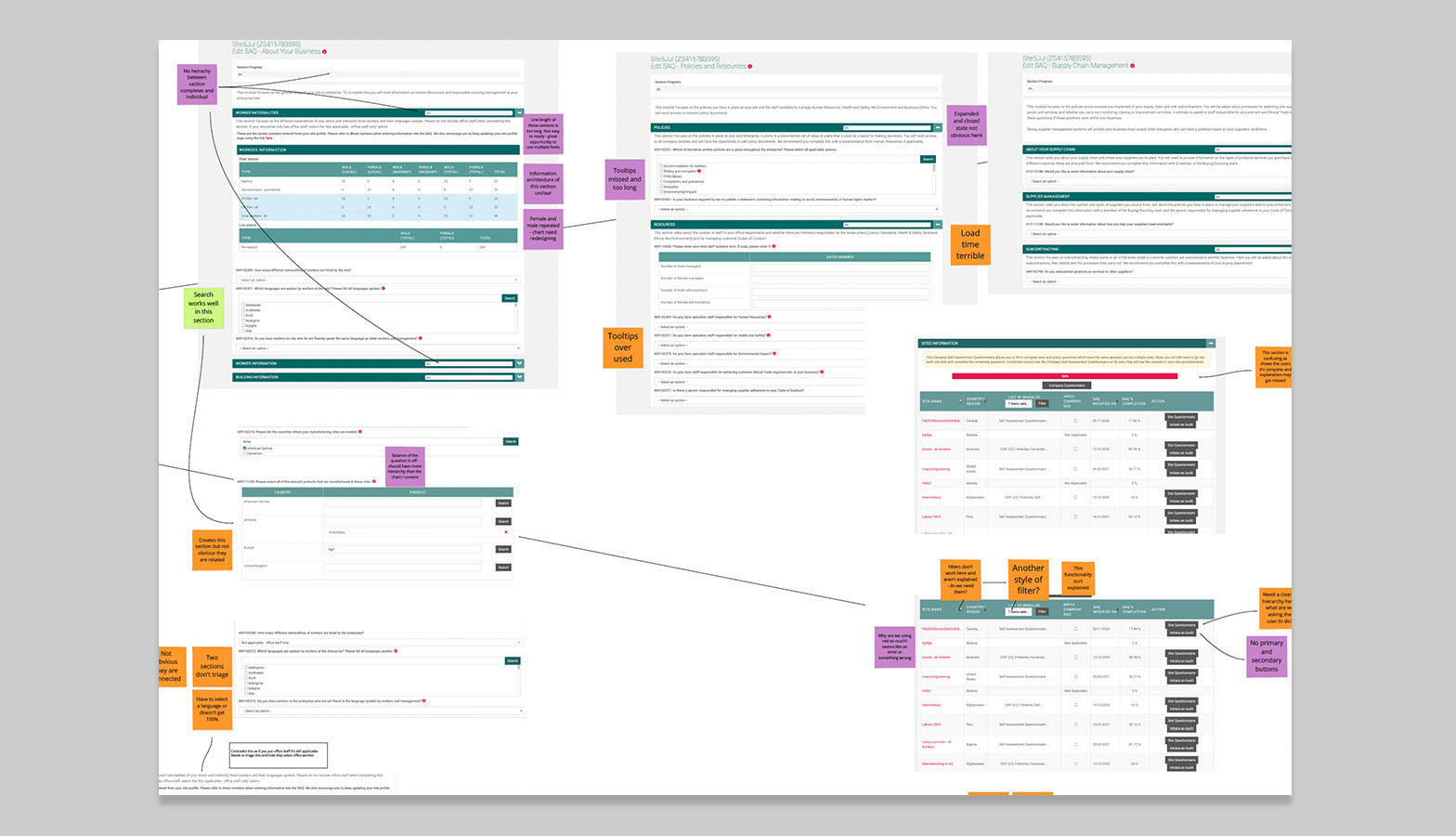
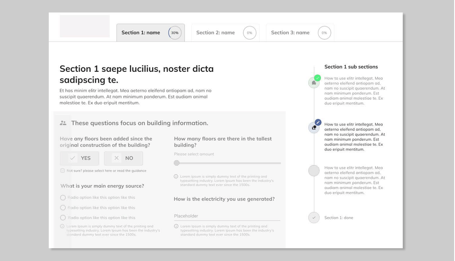
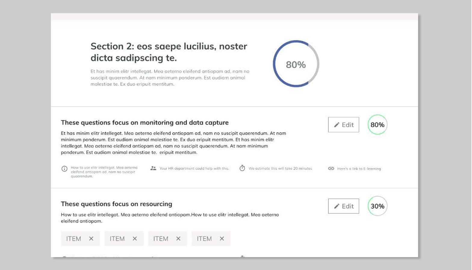
It was quicker and easier to start with internal teams to understand supplier pain points. I interviewed 10 Sedex staff across Member Services and Relationship Management to capture trends and frustrations. Findings were analysed in Airtable and high level findings were prioritised. I found suppliers often felt the SAQ was designed for buyers, not them. The system was slow, guidance was skipped, and people struggled to complete sections requiring input from multiple departments. This section also felt long and overwhelming, especially for users who may not use a computer or device regularly as part of their work.

Top pain points ranked

  • 1. Platform is slow to load
  • 2. Long repetitive form
  • 3. Difficult to collaborate with other departments online
  • 4. Suppliers are unwilling to spend time on it
  • 5. E-learning resources are unused
  • 6. Suppliers don’t see the value
  • 7. Irrelevant questions reduce completion rates
  • 8. Benefits of completing are unclear
  • 9. Concern over sharing sensitive information
  • 10. Suppliers skip or don’t read section descriptions

Collaborative workshops

I ran hour long remote Miro workshops with the Ethical Trade Coordinators and Member Services team to explore early ideas and prioritise improvements.

ETCs: Pain points

  • 1. Suppliers don’t see the value
  • 2. Section descriptions are unclear or skipped
  • 3. SAQ looks too long—suppliers don’t want to commit time
  • 4. Platform is slow to load

Member Services: Pain points

  • 1. Hard to get information from internal departments
  • 2. Irrelevant questions can affect final % score
  • 3. SAQ looks too long—suppliers don’t want to commit time
  • 4. Suppliers don’t see the value

Supplier User Experience Survey

I sent a Qualtrics survey (translated into multiple languages) to over 10,000 suppliers. Around 3% responded, giving us insights into device use, working patterns, and platform frustrations.

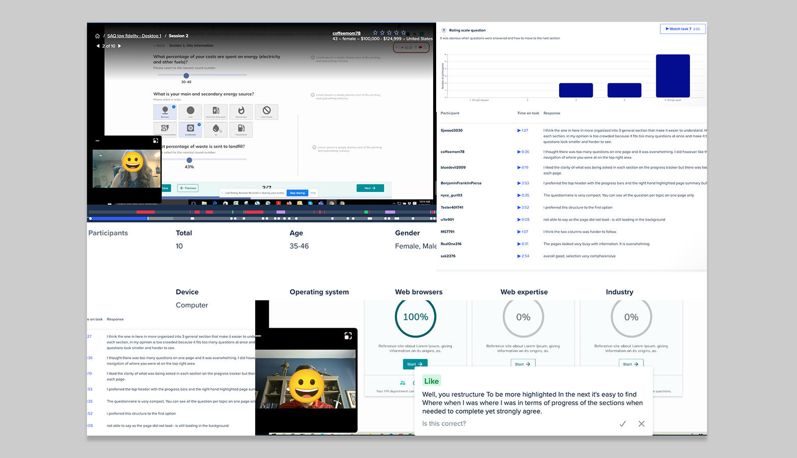
Auditing the SAQ experience

I conducted a UX audit of the current SAQ platform, focusing on visual hierarchy, typography, button behaviour, navigation, and feedback loops. It was clear that reducing cognitive load would be key.

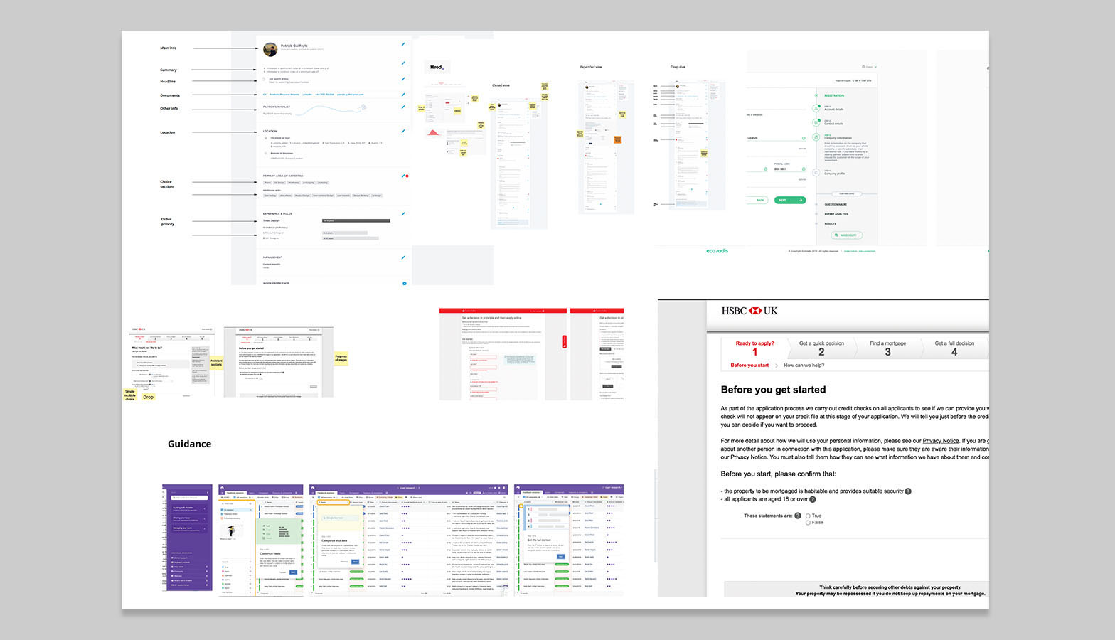
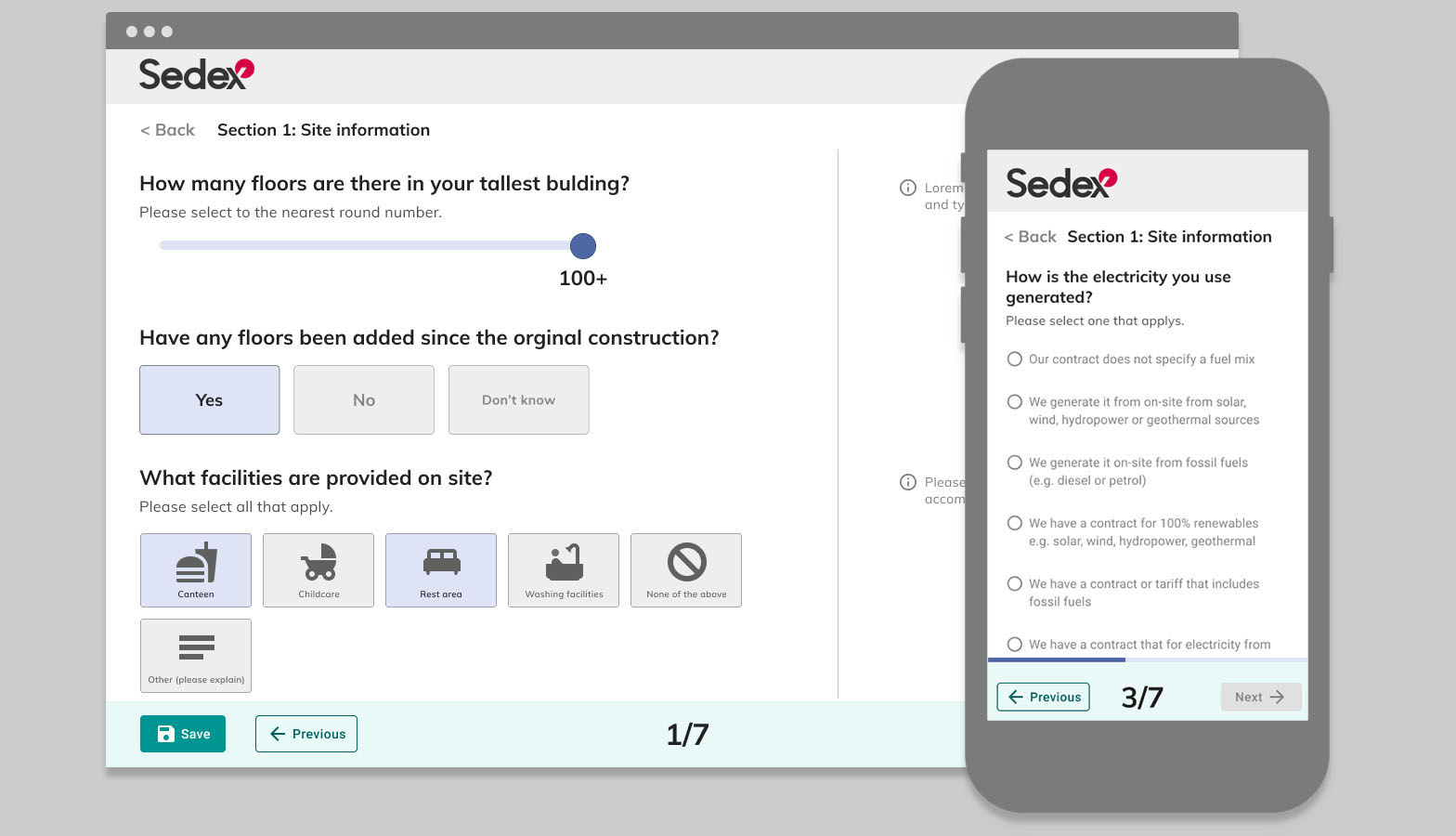
Shaping a new SAQ flow

The team focused on redesigning the first 20 questions, a test section to validate changes before scaling. I mapped user journeys and sketched three different low-fidelity wireframes to explored layout, guidance, and progress feedback.
Ideas were informed by research, audit insights, and previous workshops.


Low fidelity options

Moving into low fidelity I landed on three options, each reflecting a different navigation models.

  • Option 1 – Bitesize dashboard approach with clear tracking, without sub sections
  • Option 2 – Tabbed sections with embedded guidance, with subsections in sections
  • Option 3 – Linear form with descriptions and tooltips, with subsections in sections

This was my first opportunity to share something with the internal teams I was working alongside. I was moving rapidly, so getting a low-fidelity version in front of the developers and PM early on was important—it gave us a chance to align on direction and start discussing feasibility.

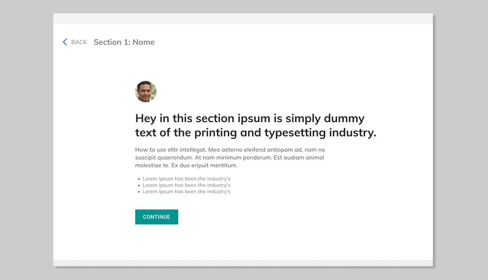
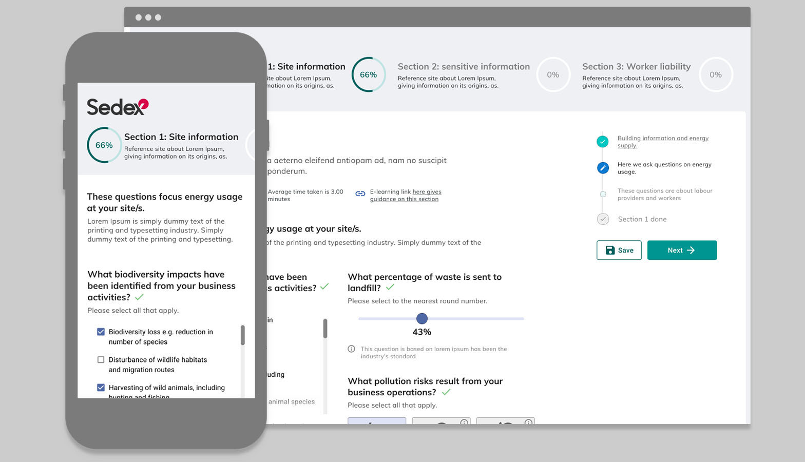
Mid-fidelity and sequencing

Reviewed and reorganized SAQ questions, then developed two Figma prototypes based on research, feedback, and competitive analysis.

  • Option 1 was presented in three distinct sections on a dashboard. Each section was broken into manageable steps. A progress bar or similar indicator showed the user’s current step within the overall SAQ. “Save” controls were conveniently located at the bottom, allowing users to save progress at any time.
  • Option 2 was designed so the user was taken directly into SAQ 1 upon entry. Progress through the three sections was visually tracked at the top of the interface. Each section included a concise description and helpful tips. Questions were displayed in a two-column layout on desktop for efficient completion. Given the complexity and potential for misinterpretation of some questions, helpful tooltips were provided beneath each one.
  • 🗄️ Data Collection and backend Integration

    Once the core interaction flow was mapped, we considered how the product would gather and handle data. This included planning points in the journey where user input, behavioural metrics, and system-generated events would be collected. These touchpoints were aligned with backend APIs, ensuring data could be transmitted securely and efficiently to the server for storage and processing. The focus was on understanding the sequencing of questions and delivering the right ones to each individual at the right time, ensuring that the data collected was relevant, accurate, and useful for downstream analysis.

    🔎 Testing and refining the concept

    I ran two rounds of moderated and unmoderated user testing with 10 suppliers per round. From this, I developed a refined low-fidelity prototype using a one-column layout, simplified structure, and improved spacing to help reduce friction and increase clarity.

    Project Title
    User testing
    • Key objectives of testing:

    • • Measuring the time taken to complete specific tasks.
    • • Assessing user understanding of sections and subsections.
    • • Evaluating the clarity and helpfulness of guidance within the Self-Assessment Questionnaire (SAQ).
    • • Determining the clarity and effectiveness of feedback provided upon question completion.
    • • Identifying and documenting any general usability issues or areas for improvement.

    Results

    This is a summary of the key research findings. More detailed information can be found in the full research reports and transcripts.

    • ✅ Users felt answering similar questions with differtent UI was easy to understand and kept them engaged for longer
    • ✅ On both versions user found it easy to understand the different sections / subsections of that make up SAQ1. 18/20 strongly agree
    • ✅ Users felt option 2 made it easier to get through the questions quicker
    • ✅ In both options it was clear where guidance was but user favoured option 1 as it was clearer in terms of guidance
    • ✅ Users felt it was clear when questions were answered with 17/20 strongly agreeing and non finding this difficult
    • ✅ Users felt both version were well structured and organised
    • ⛔️ Users felt option 1 was too time consuming and contained too many steps
    • ⛔️ Users unanimously felt option 2 was too cluttered with information
    • ⛔️ The majority of users felt option 1 didn’t have a clear overview of questions that needed answering and favoured option 2 for this reason
    • ⛔️ Users felt option 2 was cognitive overload and guidance was less clear
    • ⛔️ The double column made it visual confusing and poor flow.
    Project Title
    Updated low fidelity
    • • Progress bar tested well, bringing it more to life
    • • Clearer sign post of section and guidance
    • • Changing layout to one collum with guidance sat to the right
    • • Steps of sub section tested well, using them as navigation
    • • Less cluttered information, more space and a clear guidance

    Final outcome

    I delivered a redesigned first section of the SAQ, informed by user testing, workshops, and research. The new layout improved task clarity and engagement — laying a foundation for scaling improvements across the full questionnaire. Getting the first section done was the hard part, but once that was in place and data was flowing, we could easily build out the other sections using the new components and feed everything back into the backend to generate insights.

    Example of individual component interactions
    Example of individual component interactions
    Example of individual component interactions

    📊 Outcome & Impact

    Load times for the first section improved by over 30%. Within 12 weeks, 95% of SAQs reached 80% completion.

    "Finally the SAQ is clearer and easier to use — our suppliers are no longer complaining to us."Source: Member Services Team Lead, post-launch feedback

    Site satisfaction also increased, with post-launch hot jar survey scores up by 18%.

    Mobile usage rose by 32%, reflecting a smoother experience on smaller screens and marking the beginning of stronger adoption on mobile devices.

    Average engagement time rose to 12 minutes before users saved or left to complete the SAQ later, up from just 3 minutes previously.Source: GA, data team