I joined The Economist as part of a new dedicated future customer experience (FCX) team. The Economist identified many of their customers found the online experience disjointed and frustrating, leading many to unhappy churn.
The goal was to implement a seamless, cohesive and streamlined end-to-end experience. An integral part of this, in line with the businesses objectives was to dramatically improve subscription sales. A key part of FCX was improving the subscription journey from selecting an offer to registering and checking out.
UX
UI
Research
Figma
User Testing
Miro
The Team
I was the principal product designer working on FCX alongside a dedicated PO, scrum master and a business analyst. I worked with a large team of developers across two platforms; Salesforce and Limio which together created FCX.
Discovery: defining the work
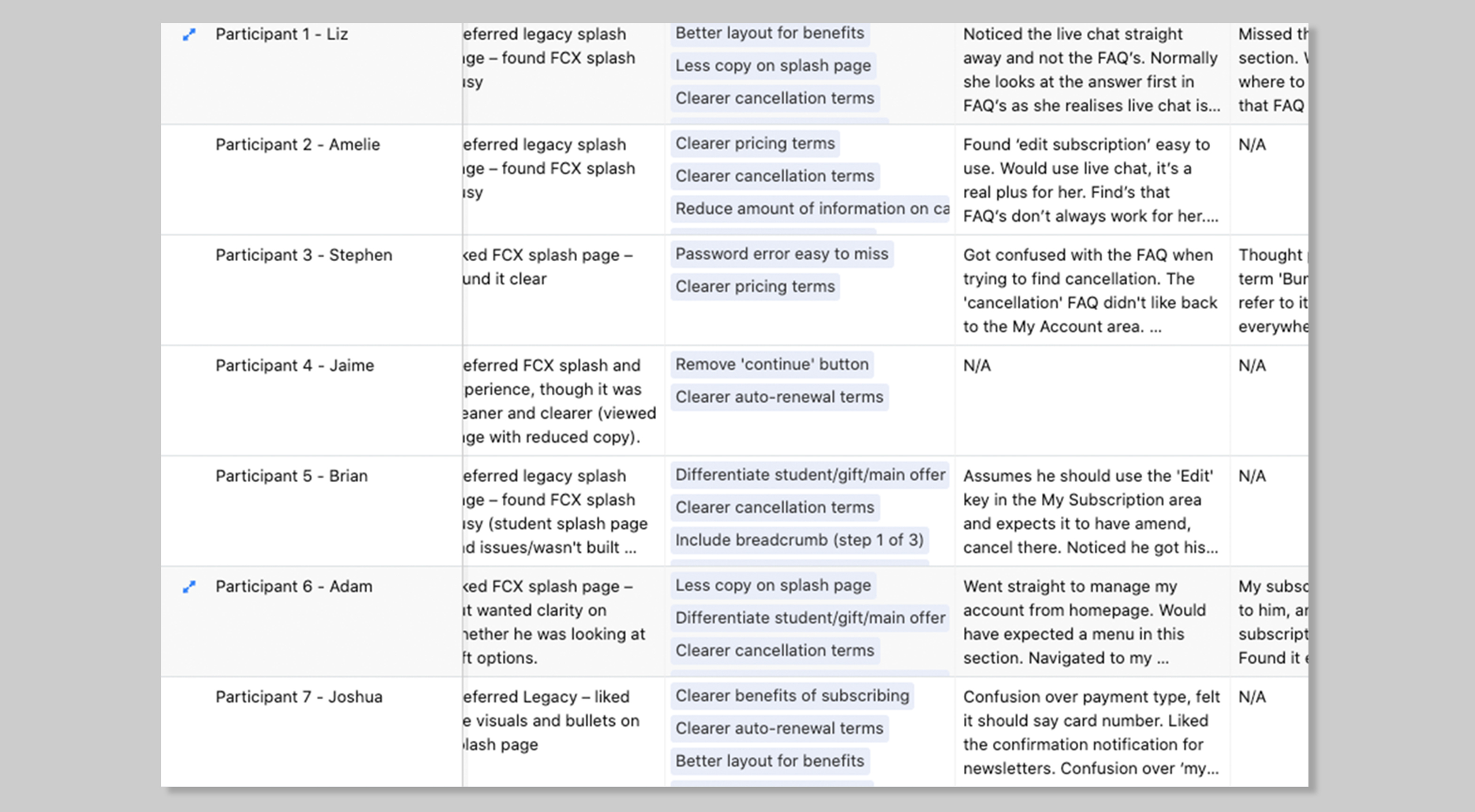
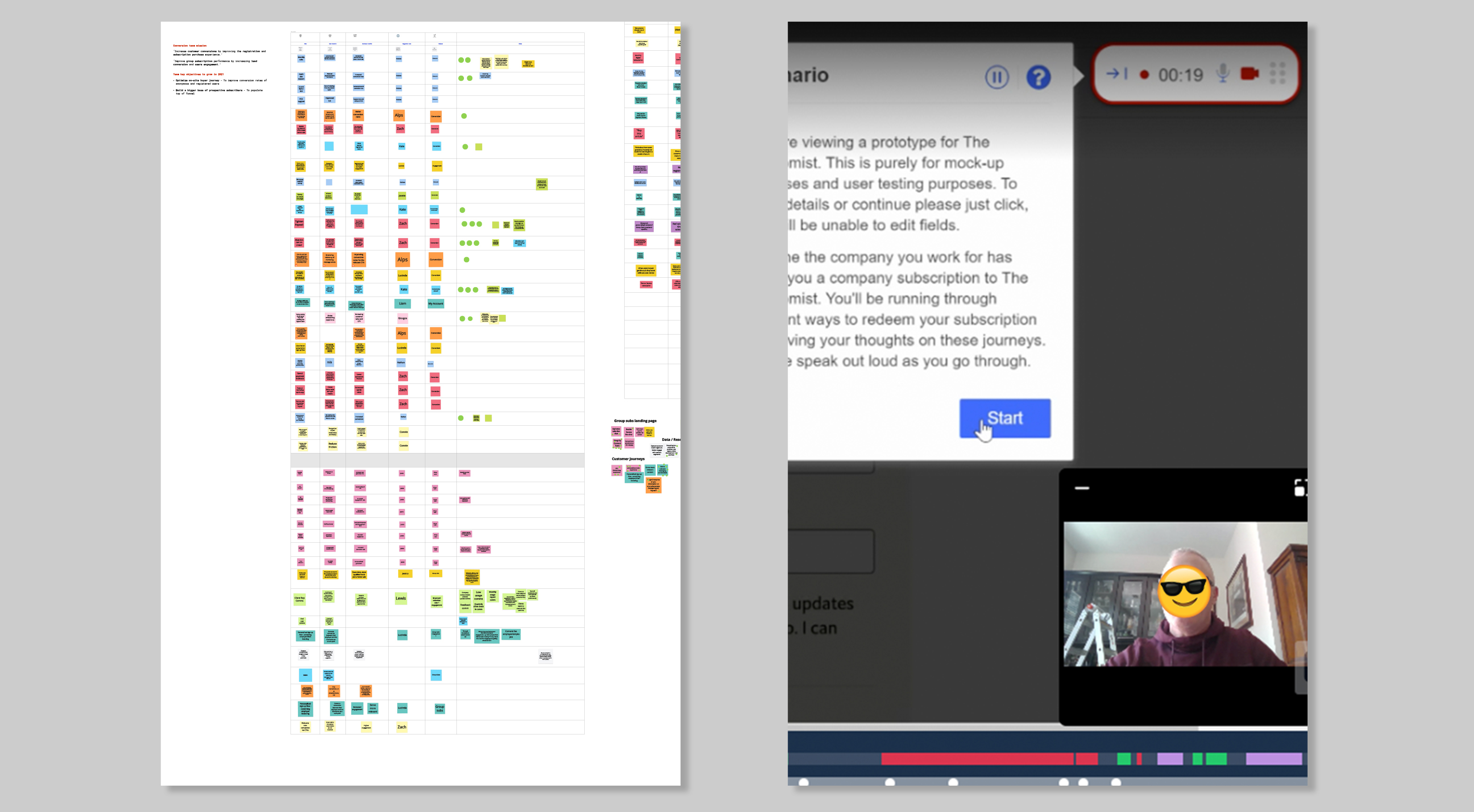
I ran hour-long interviews with 16 users to explore the existing subscription journey. Insights were grouped into key stages: offer page, registration/checkout, and confirmation. I mapped common themes in Airtable and ran a workshop with stakeholders to prioritise solutions.
Also using UserZoom, I then ran unmoderated tests with The Economist’s current and target audience to validate or challenge ideas. Playback videos, timings, and heatmaps helped us assess interaction quality and user behaviour. I was also fortunate to be able to use dovetail to look at The Economist extensive research repository.
-
-
Pain points
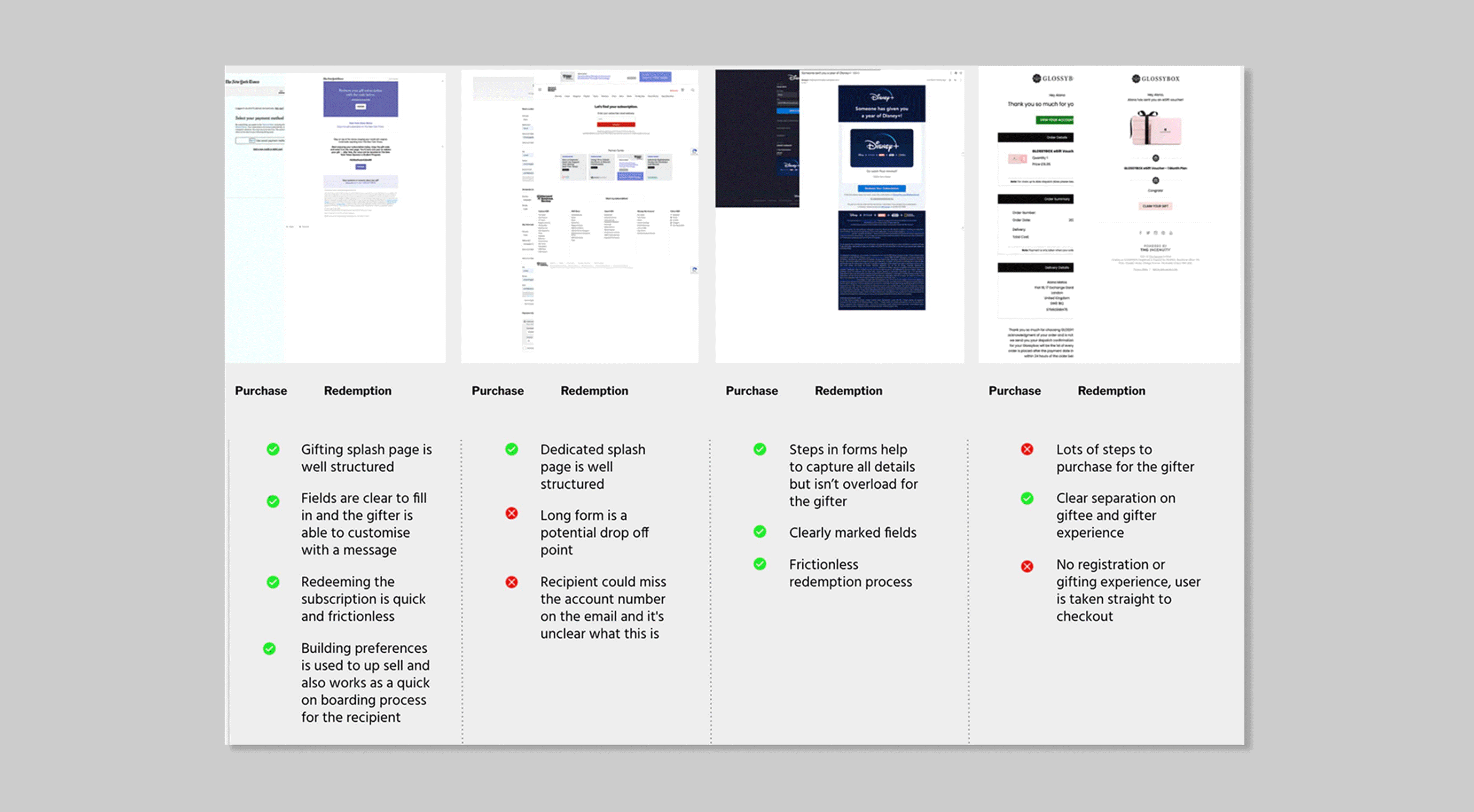
I did a competitor analysis and established pain points in the existing journeys. I worked with the data team to look at existing drop-off points using GA and Hotjar recordings. I asked members of the team and stakeholders to comment on our findings.
Analysis of Prior UI and Competitor Subscription Journeys
Pain points: Registration
• Clearer terms and condition
• Clear registration fields
• Progress bar to know where I am in the process
Pain points: Offer page
• Better and clearer layout of benefits
• Clearer comparison of prices
• No differentiation of gifting and student prices
• Too much information on the page
• Poor accessibility on smaller devices
• Auto-renew terms unclear
• Metric: Decision making time averaged 3.35 minutes
Pain points: Confirmation
• Unclear if my purchase had gone through
• Confirmation didn’t load
• No clear confirmation of purchase
• No clear cancelation terms
Pain points: Checkout
• Remove login and registration from checkout
• Continue button is confusing
• Checkout feels disjointed
• Payment type is unclear
• Checkout slow to load
• Metric: Bounce rate is high 57% at checkout
Product ideas
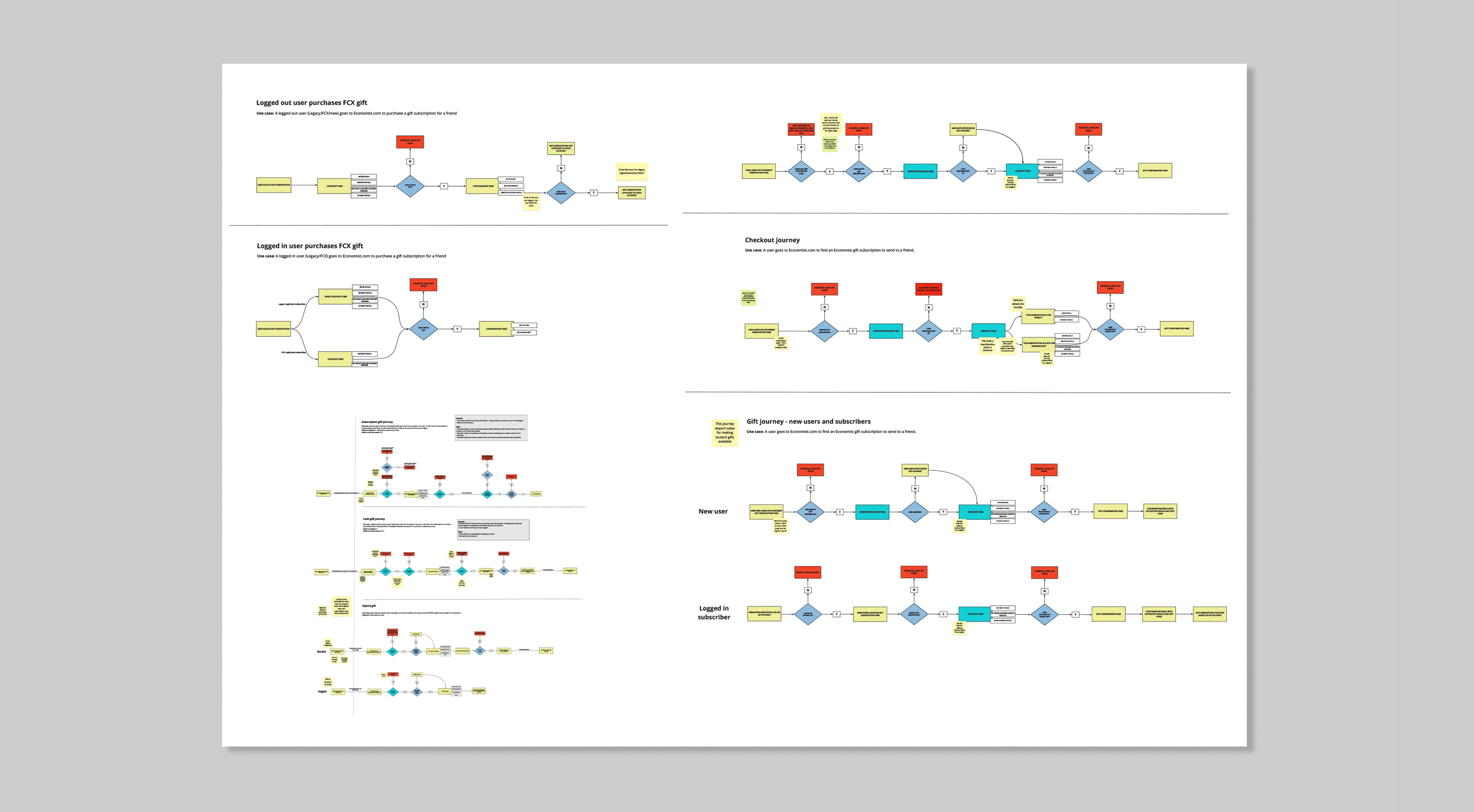
I then started to map out user journeys and consider any pain points that would arise. Whilst sketching options and wireframing low fidelity.
Mapping and visualising user journeys
Wireframing options
Wireframing options
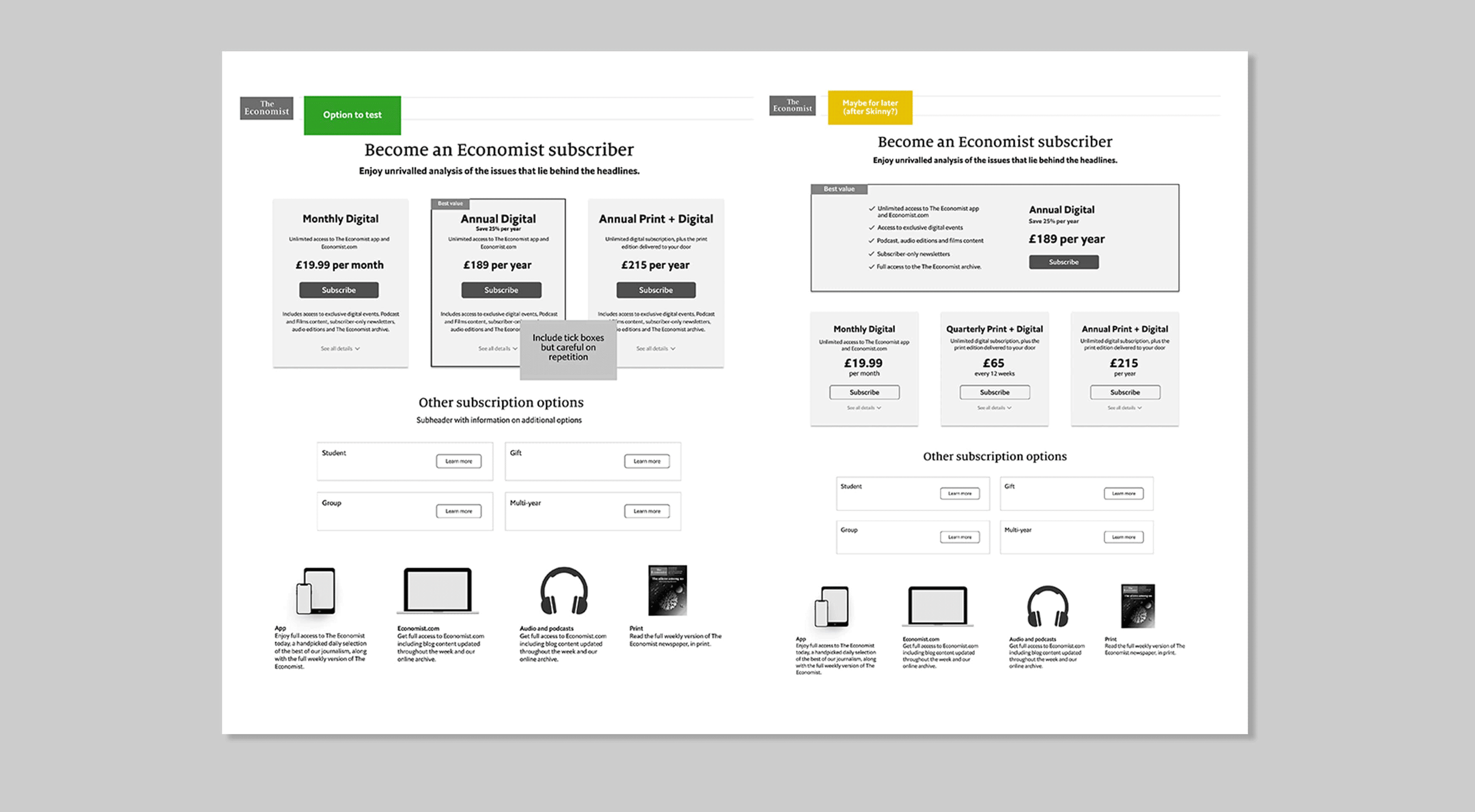
Subscription offer pages
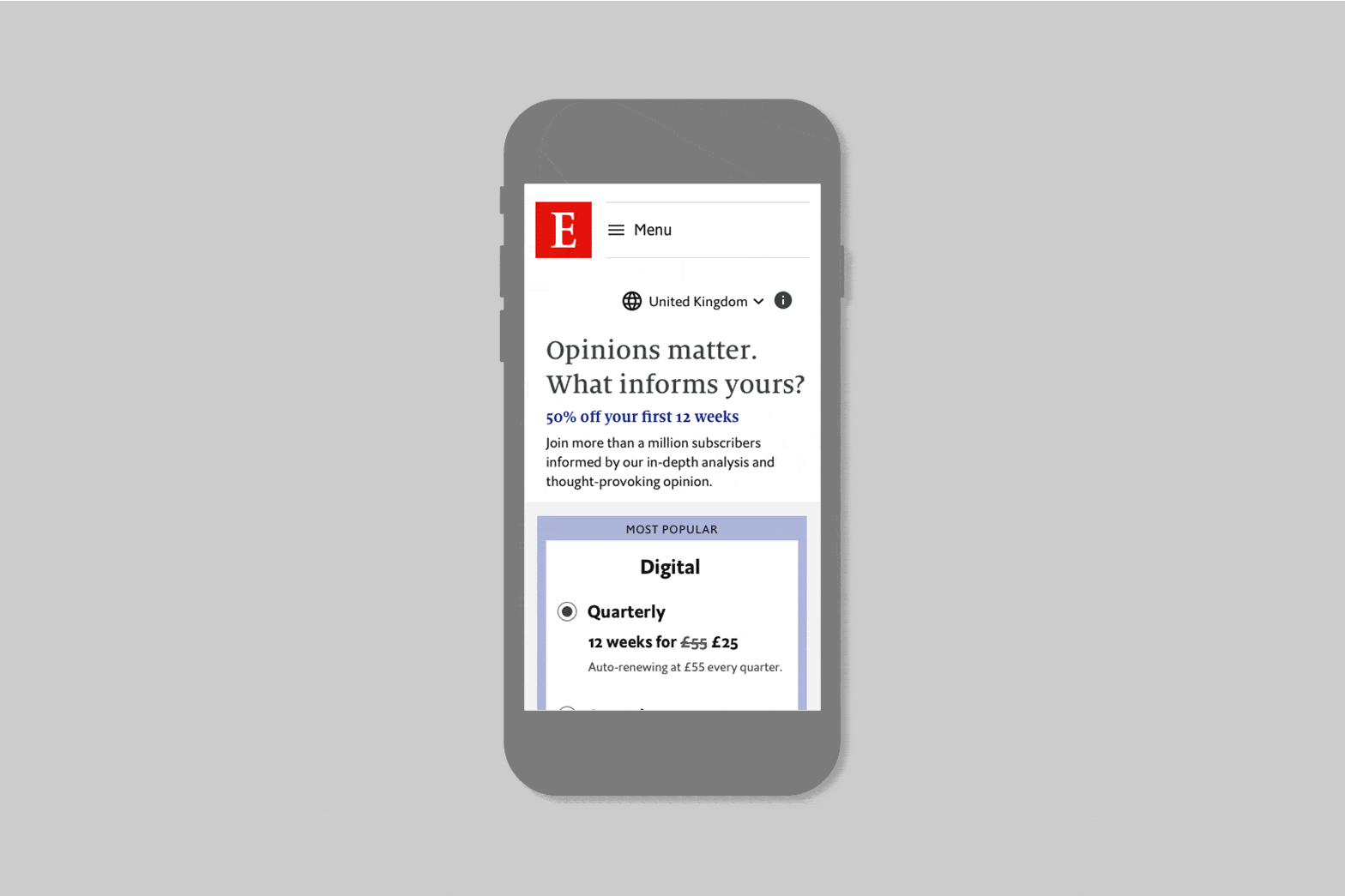
On the offer page I wanted a combined approach showing digital and print + digital together for a clearer comparison and individual pages for subscription types. Currently the most popular subscription was the print+digital quartley with 35.8% share of subscriptions followed by the digital Quartley with 35.2%. The key push from the business was to increase Annual subscriptions and digital only subscriptions.
From here we then put together low fidelity wireframes and prototypes. We presented these journeys and prototypes to the developers to establish any limitations. Vital, as the end product would be built across two platforms and we’d need to ensure they interacted correctly. We then used user zoom for some initial un-moderated testing.
📱 Subscription offer page UI
🖥️ Subscription offer page UI
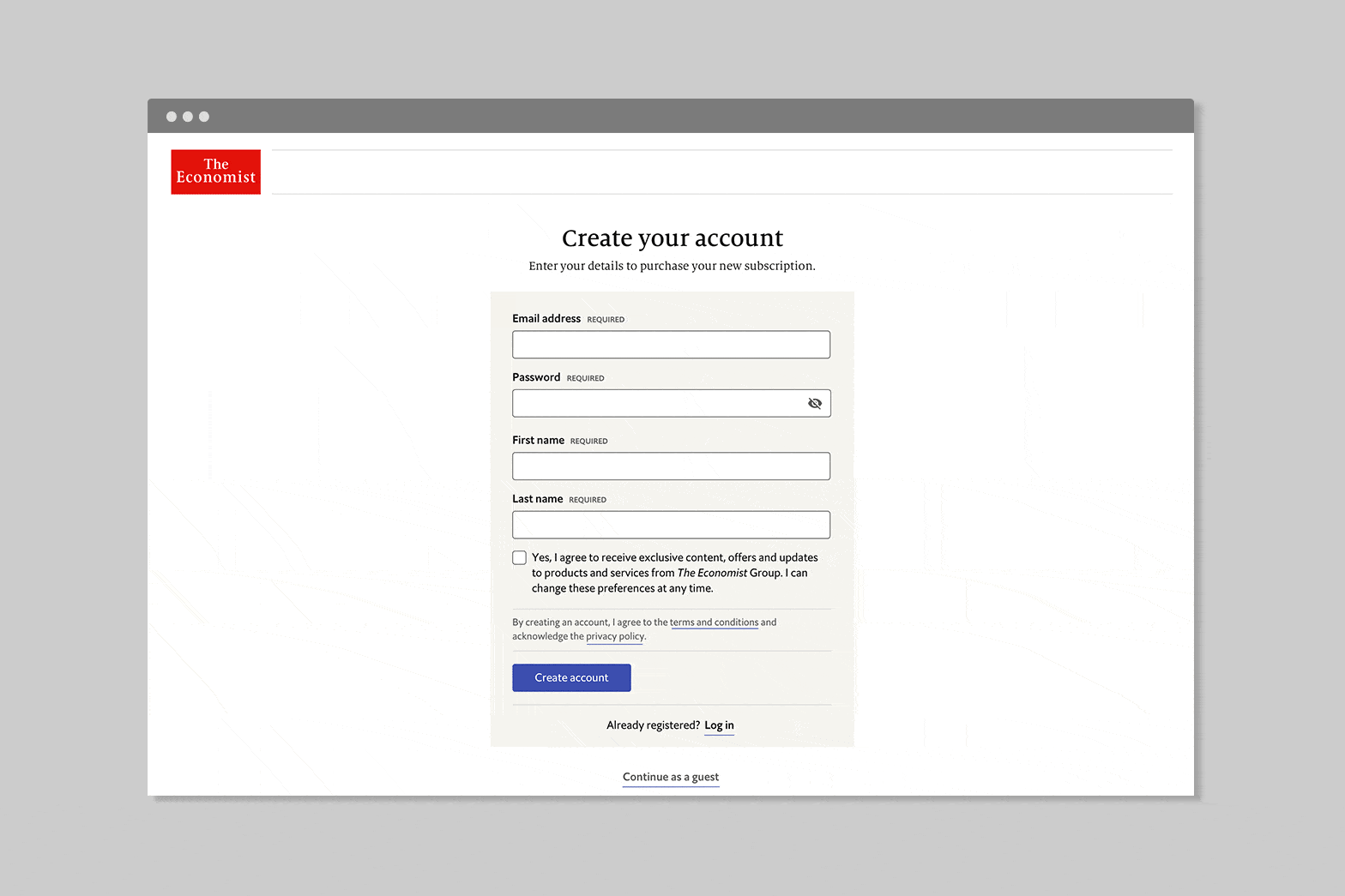
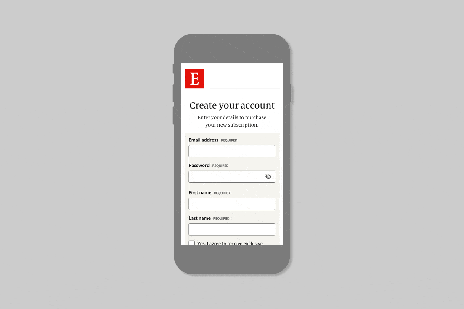
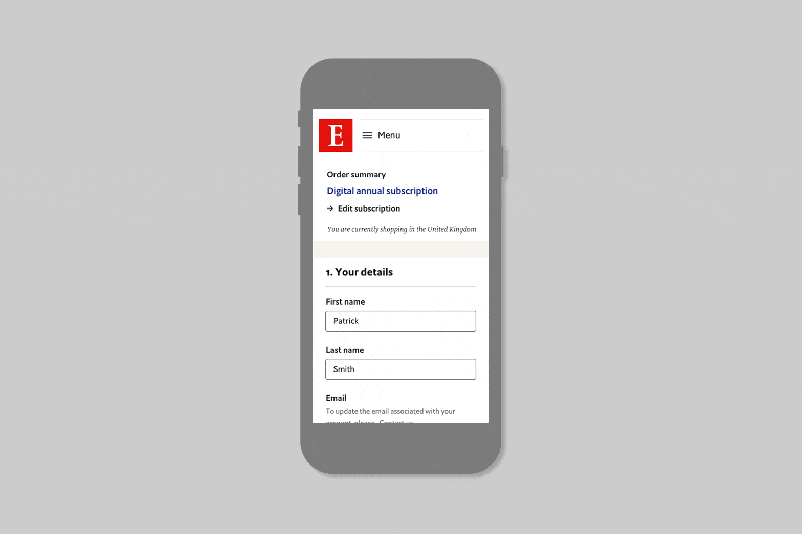
Registration
Registration clarity was a key focus, informed by competitor analysis and close collaboration with internal stakeholders to minimize potential friction.
📱 Registration form ui
🖥️ Registration form ui
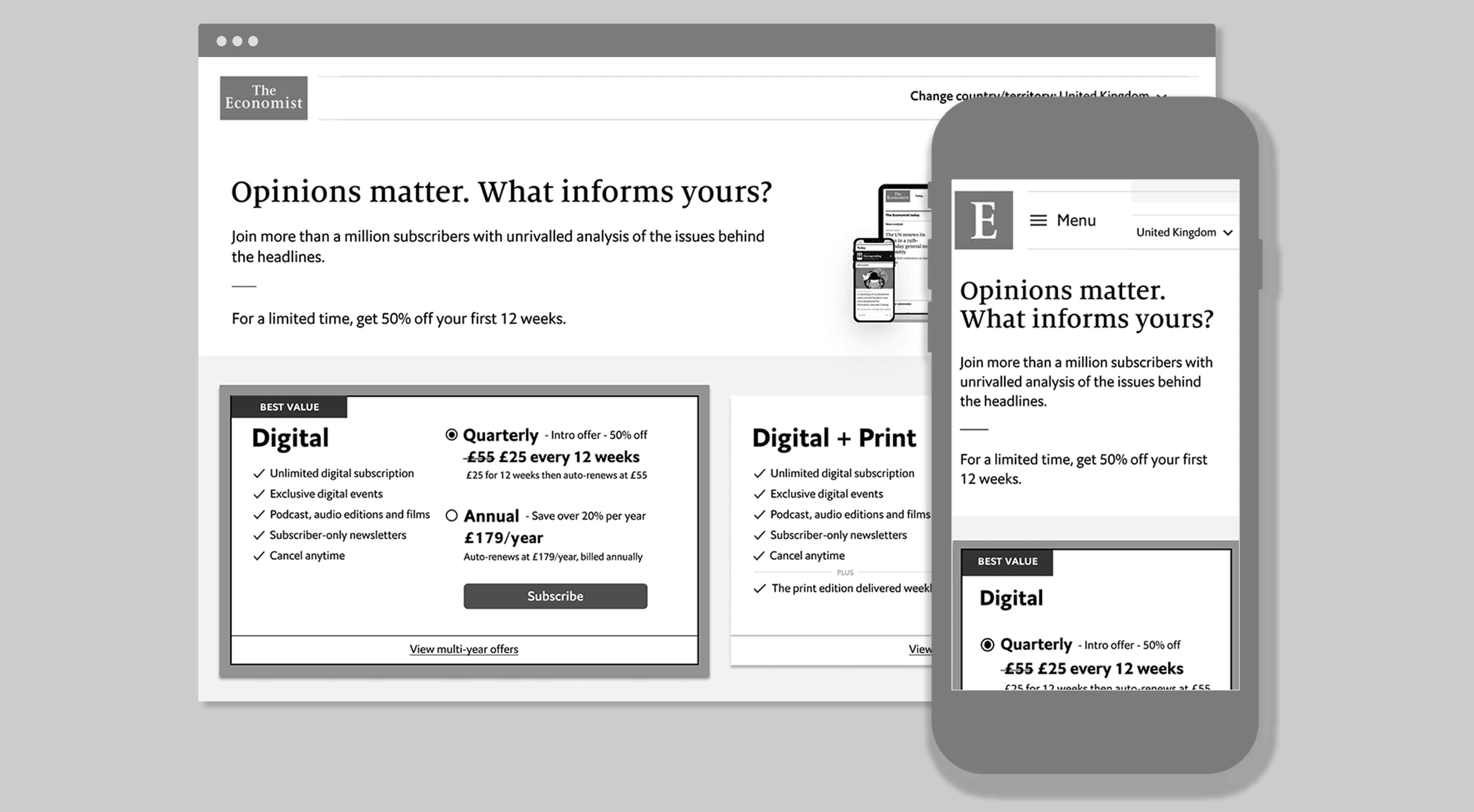
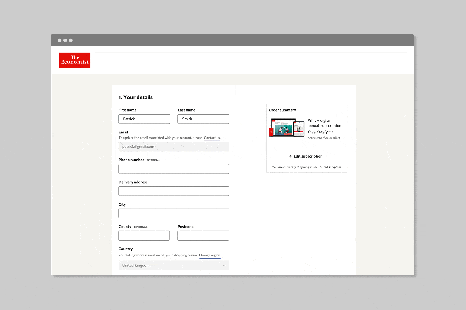
Checkout
We went through multiple versions, both low and high fidelity, mapping out key areas and analysing historic data with the aim of simplifying and reducing friction. Related steps were grouped logically (e.g., Shipping > Payment > Review), and key details like shipping options and costs were displayed early to minimise user effort. A progress bar was added initially to help users track their position in the process.
Over six months, we ran scrappy user tests to gather quick feedback, iterating as we went. We tested versions with broken-down steps across multiple pages, but the one-page version ultimately tested best. This approach had challenges, particularly with error handling when sections weren’t completed. To address this, we implemented a staggered approach, disabling parts of the form as users moved through each step to ensure they completed necessary fields. We also leveraged information from subscriber renewals to reduce friction at key points.
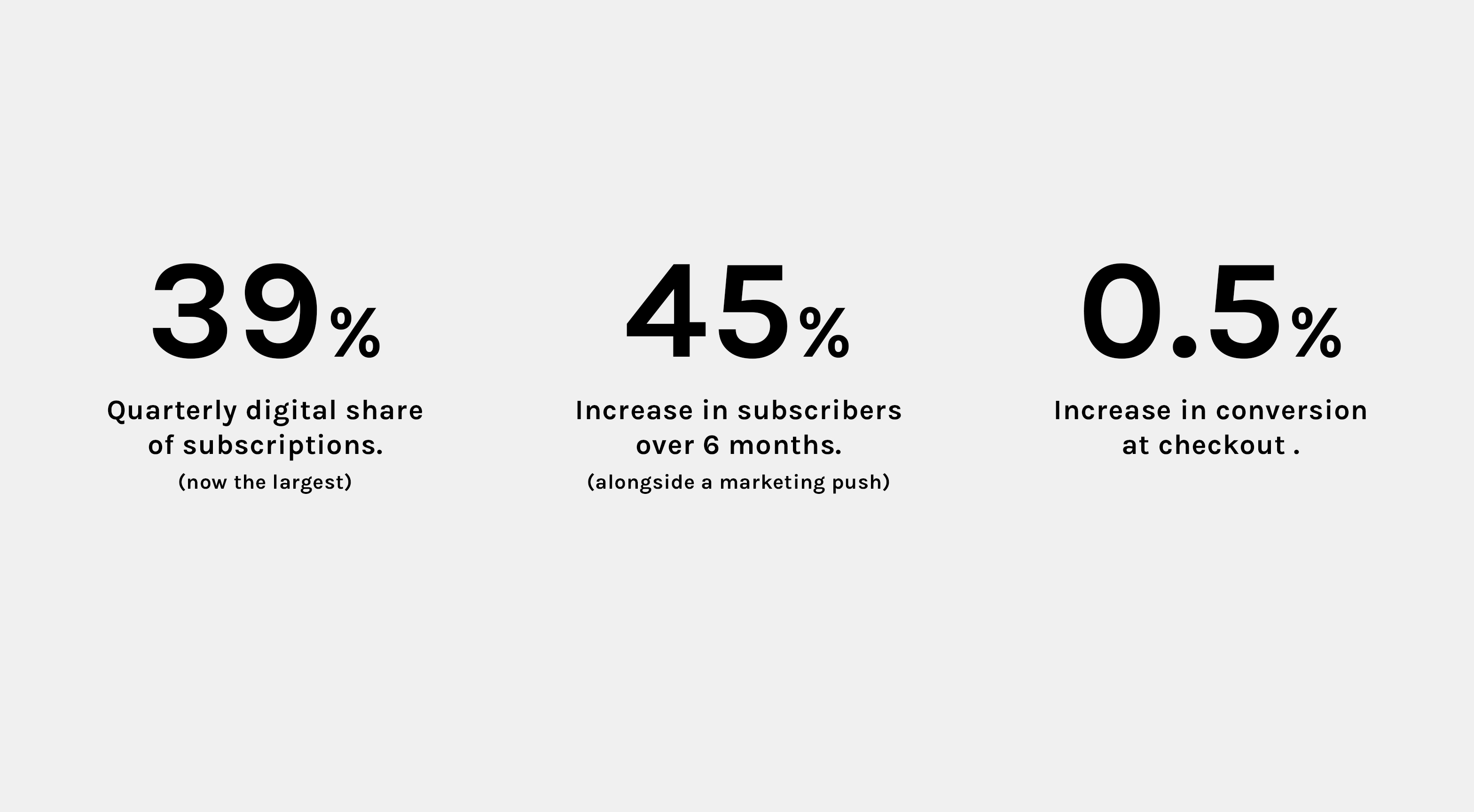
Using GA, we tracked drop-off points and conversion rates, refining based on real-time data. Hotjar helped identify where users dropped off, focusing our efforts on key friction points. After A/B testing, we achieved a 0.5% increase in conversion rates and a 6% reduction in drop-off time at checkout.
📱 Checkout UI
🖥️ Checkout UI
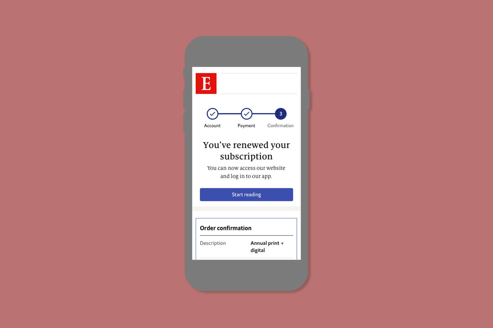
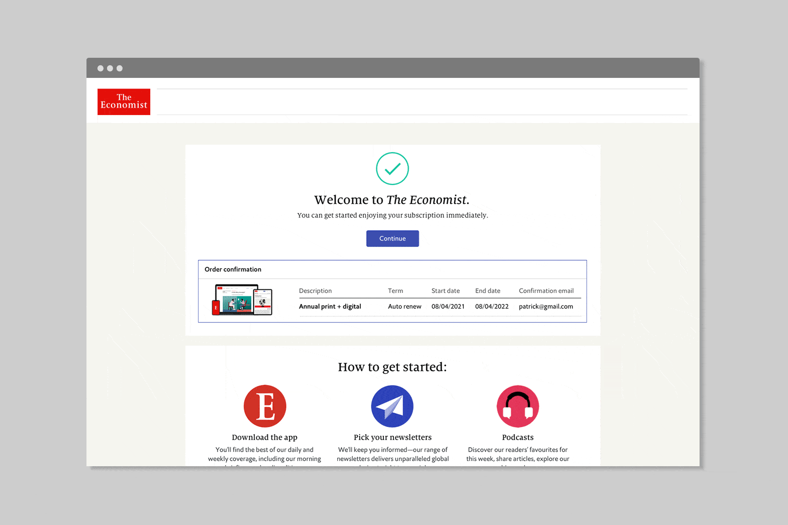
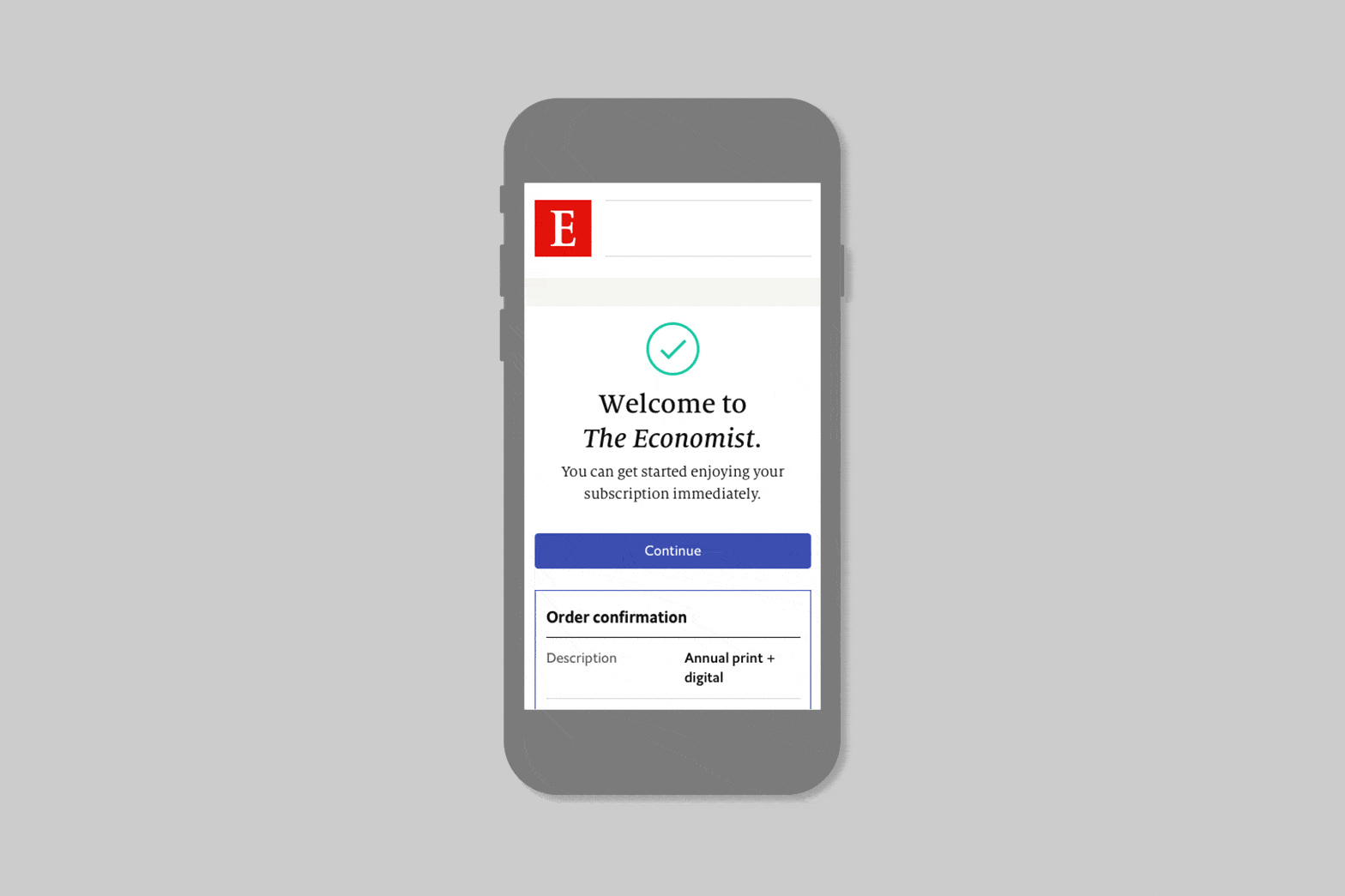
Confirmation
User testing had flagged a lack of clear feedback for the user after their purchase is complete. Details of their order being unclear was also a pain point. A requirement from the business was to create an MVP onboarding experience. Design wise I looked at the information architecture of the table and using typography weight / colours to give prominence to the vital information.
📱 Confirmation UI
🖥️ Confirmation UI
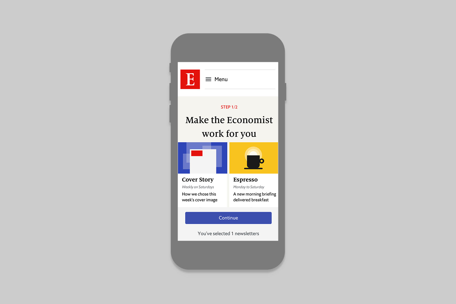
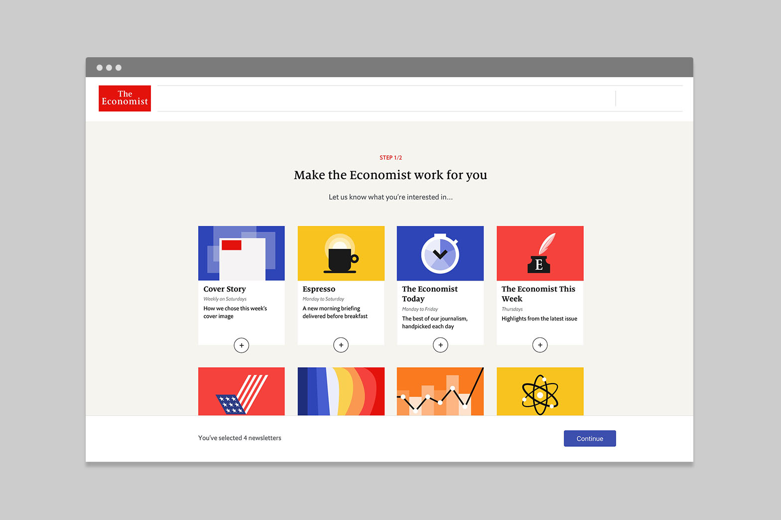
Onboarding
We then explored our post-onboarding experience, focusing on how to guide users into our platform and encourage engagement with features like newsletters, podcasts, and apps. At the time, we drew inspiration from streaming services like Disney+ and Netflix, mapping out user journeys after registration. And language schools like Babell and editorial like New York Times games.
We expected this approach to resonate with users, but testing showed otherwise. Often, users wanted to read a specific article or view a particular piece of content, and any additional friction wasn’t tested. While we considered an A/B test, the development effort was too high. Instead, we introduced a preferences section within the account area, providing a more seamless way for users to tailor their experience. We found strong engagement with this approach, and it was well received in user interviews.
Parallel research
📱 Onboarding
🖥️ Onboarding
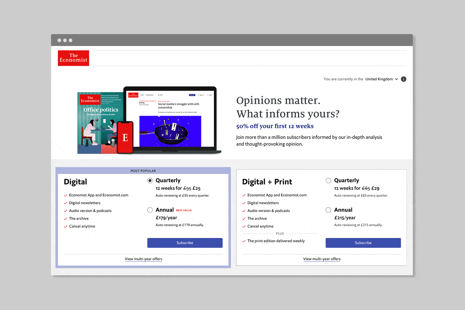
Refinements
Prior to a big promotional push I looked at how we could improve the offer page. I wanted to improve decision making time and increase Annual digital subscriptions. To achieve this I used typography with less weights / sizes and more space. This created a new hierarchy which put more emphasis on the pricing over the term. We also move Annual above Quarterly so this was pre-selected.
Results: Decision making time improved from an average of 03.23 to 02.58 minutes. Moving Annual above Quarterly didn't indicate to increase user selecting annual subscriptions. Further A/B testing was needed to properly test this hypothesis.