Reimagining Sedex: A Design System Approach

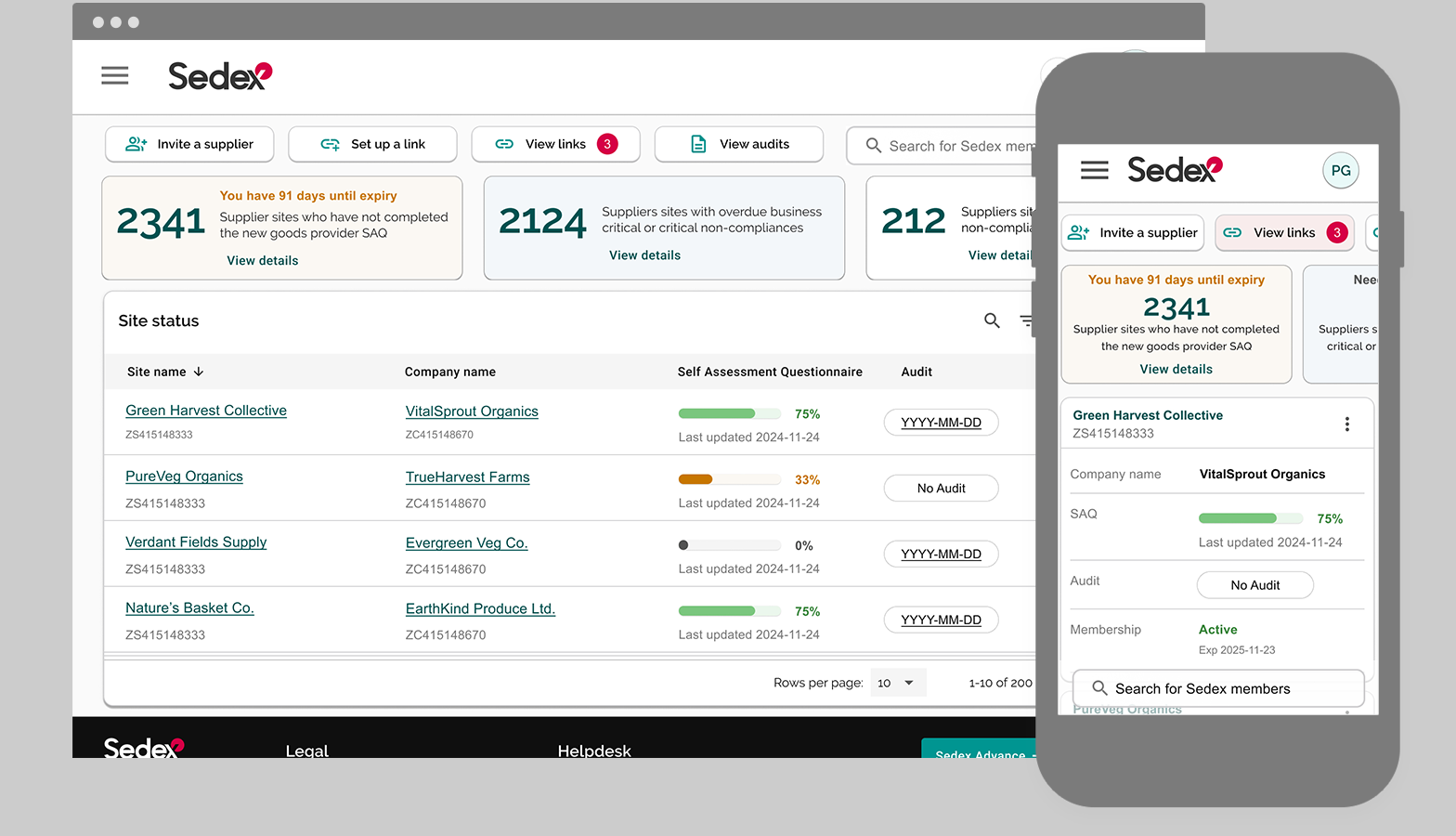
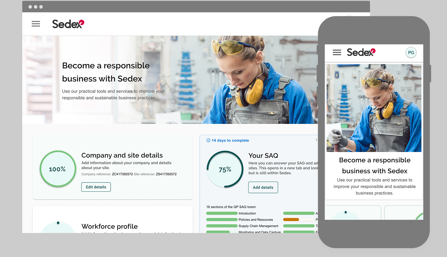
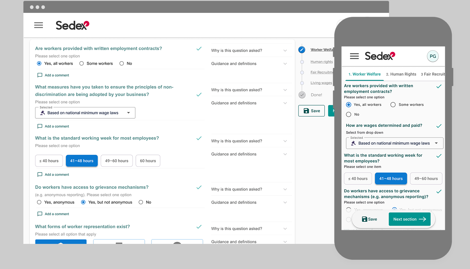
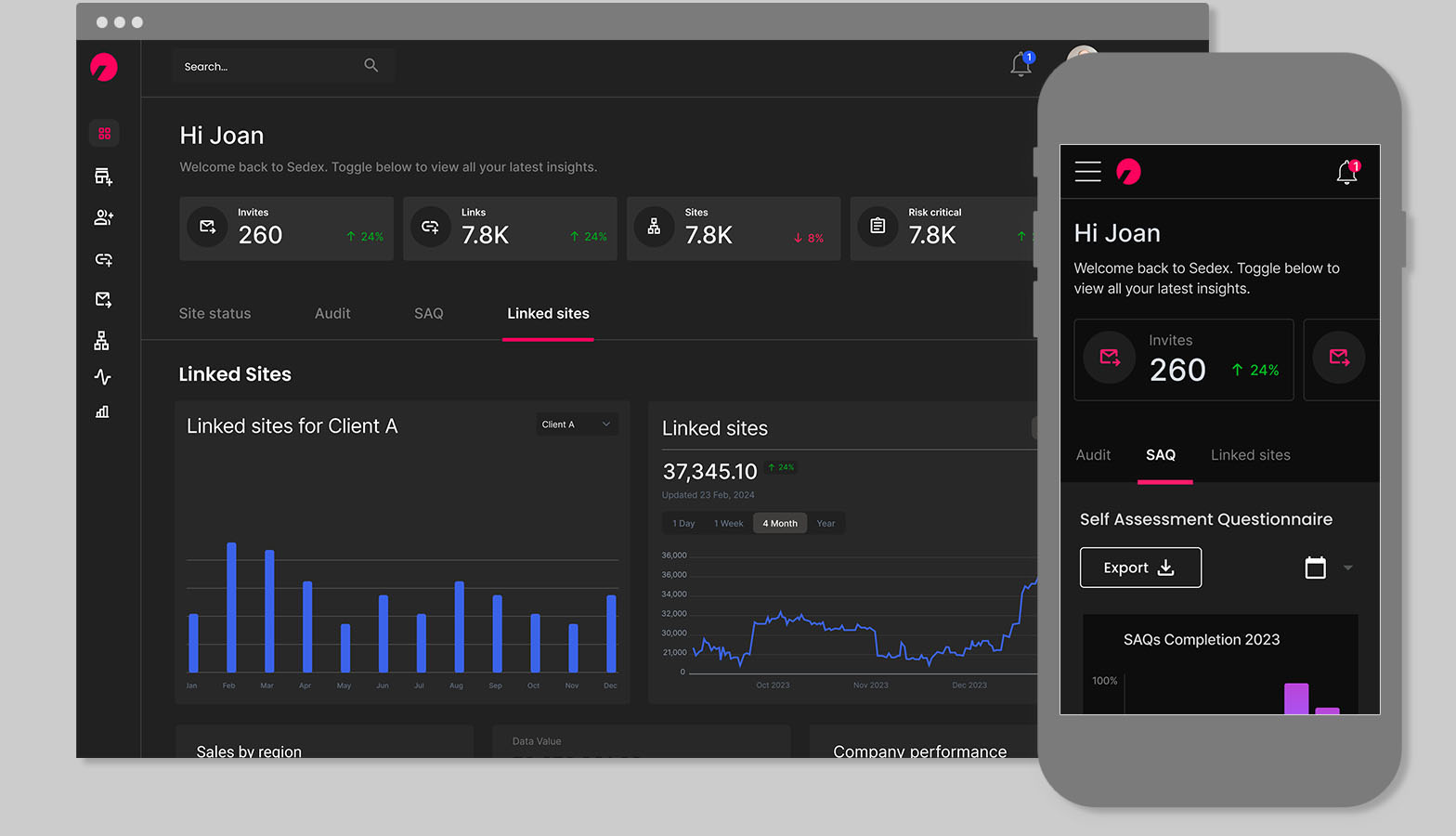
Sedex, one of the world's largest supply auditing platforms, was facing challenges with an underperforming platform and growing competition offering innovative UIs and smoother experiences. Member feedback on performance and UX was increasingly critical to its success.
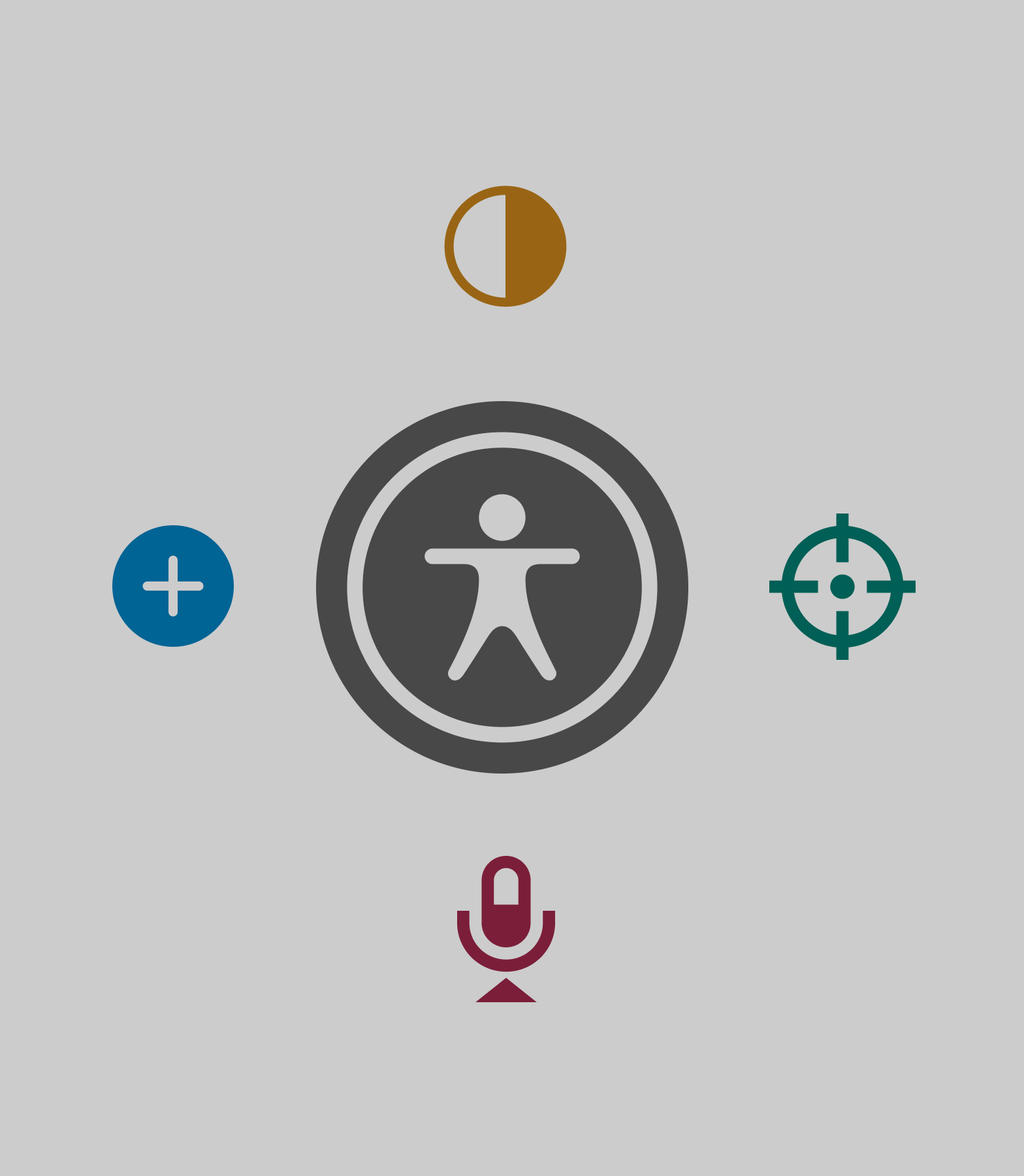
UX UI Design System Ceremonies and Workshops Figma Storybook
Image for Right Text Section

🧩 The Challenge: Previous Platform

A siloed UX team and a heavily customised off-the-shelf design system had created an overly complex, inconsistent component library with layout issues. There were too many components and styles, and without clear guidance, it caused confusion.

The front-ends weren’t using reusable components, so a big part of the project was gaining their trust and getting them to adopt a shared approach. I worked closely with the front-end architect to align on standards and rebuild the foundation.

πŸ‘₯ Around 40% of Sedex core members, a group of key buyers regularly involved in feedback on the platform, said the site felt jumpy and like moving between different sites instead of one smooth platform.

🎯 The Goal: Scale a robust, token-based design system to streamline workflows, unify how teams build, and support a wider initiative to improve platform performance across Sedex.

Image for Right Text Section
The basics: This is illustrative; see the final outcome for the full design system.

βš™οΈ Approach & Process: Starting from scratch

There were far too many components and styles. Without clear guidance, this led to inconsistent UIs and confusion across teams. I decided to start again β€” gave the team only the basics, built around core MUI components. From there, we rebuilt gradually, introducing new components through ceremonies with clear usage and rationale.

The basic system covered 12 colours for brand, UI states and feedback, two typefaces with two scales, buttons and text buttons, form fields, a single atom icon, and a library of over 100 icons with clear usage guidelines. It also included an icon button, responsive grids, and spacing rules with variables. I added paper backgrounds, toggles, switches, headers and footers. We defined things like border radius, elevation, and basic interaction states to keep everything consistent and dev-ready. Everything was kept lean and practical β€” just what the team needed to move quickly without reinventing things.

Image for Right Text Section

βš™οΈ Approach & Process: Driving Efficiency

To keep the design system practical and adaptable, I ran weekly ceremonies to introduce new components and gather feedback. We landed on MUI as a library to streamline front-end development. A key part of the process was getting both UX and front-end teams to adopt the new system β€” not just by documenting it, but by embedding it into our workflows and demonstrating how it could reduce duplication, speed up handoffs, and improve consistency across the platform.

βš™οΈ Approach & Process: Dashboard Discovery

As we moved into the second phase of the design system, working with a PM we kicked off some discovery work around dashboards β€” a major part of the Sedex platform. The old setup was one-size-fits-all for all user. I started with an audit, then worked with front-end to build a flexible, widget-based dashboard that could adapt to different users and their progress in the platform. Even though 98% of users were on desktop, I designed all components to be fully responsive and backed the mobile-first approach with data.

✏️ Getting this right meant understanding user needs, defining personas, and reworking the IA to match.

Project Title
Discovery and workshop for dashboards

🧱 Component Implementation: Building key components atomically

With the design system starting to grow through ceremonies and with my own knowledge of the platform improving over time. It was time to introduce and expand on key components and layouts I knew would be critical. Below is a summary of some of those key components.

Image for Right Text Section
Navigation components: This is illustrative; see the final outcome for the full design system.

🧱 Navigation Components: Clean and Clear

Sedex audits rely heavily on supplier data, requiring users to provide lots of information. Clear navigation and intuitive steppers were essential to guide them smoothly through the process.

πŸ‘₯ User surveys revealed that around a quarter of supplier users often felt lost in the platform and had trouble navigating it, highlighting the need for clearer information architecture and more intuitive navigation patterns.

Image for Right Text Section
Widget components: This is illustrative; see the final outcome for the full design system.

🧱 Long-form questionnaires

Our design system focused on a component library for long-form questionnaires. We created reusable components to enable efficient, consistent, and user-friendly questionnaires.

Lengthy questionnaires were a major hurdle, often leading to high dropout rates because they felt overwhelming to suppliers. A huge part of Sedex's businesses model relies on capturing data from suppliers or goods and services. Our solution was to gamify them, breaking down data collection into clear, manageable sections.

πŸ‘₯ User testing in the SAQ team showed us people were still dropping off, so we iterated, making sections even shorter and incorporating varied input types to keep users engaged and improve completion.

Image for Right Text Section
Table components: This is illustrative; see the final outcome for the full design system.

🧱 Tables: From Chaos to Consistency

Each area of the platform was using tables in their own way. Standardising this was a major part of improving performance, streamlining development, and most importantly for our users ensures consistency.

To guide this, we studied Notion's table implementation. Analyzing their approach provided valuable insights for creating powerful and adaptable table functionality within our own system.

As with our dashboard widgets, we kept these table components generic adn flexible able to handle various content and interactions . That way, different product squads could use them across the platform. We also developed extensive guidelines to ensure consistent and correct usage across all scenarios. This was the most complex part of the system to implement β€” strong file organisation made it manageable.

πŸ‘₯ Tables were a big deal in the linking section of our platform, so we teamed up with that product squad to test out new designs. We ran these tests as part of their regular user testing, and it was helpful for general usablity testing.

Image for Right Text Section
Questionnaire components: This is illustrative; see the final outcome for the full design system.

🧱 Widgets: Flexible, Modular & Multi-Use

These components came directly out of the discovery work around dashboards. I needed a way to support different user types and stages in the lifecycle, without redesigning the wheel each time. So I built a set of flexible, modular components that could be reused across contexts β€” from new users onboarding to experienced users tracking progress. Each one was designed to show feedback clearly, reflect user progress, and adapt to the role or task at hand. Everything was built to be multi-use and easy for the front-end team to plug into.

πŸ“ Design System in Practice: Tokens, App Integration & Inclusion

We defined tokens to be intuitive for designers and easily mapped to front-end code. The structure followed patterns like (usage/heirachy/colorusage/theme) background/primary/success/light for colour and for typography we defined primitives for each typographic element to standardise them. Primitives used clear labels such as XSmall, Small, Base, Large, and Light, applied across elevation, spacing, radius, and line height. This centralised structure ensured scalability and consistency.

Screenshot of Fin AI Copilot Inbox

πŸ“ Accessibility

Accessibility was built in from the start, meeting WCAG guidlines with high contrast, focus states, keyboard nav, and screen reader testing. On Android, we added TalkBack support, larger touch targets, and scalable fonts.
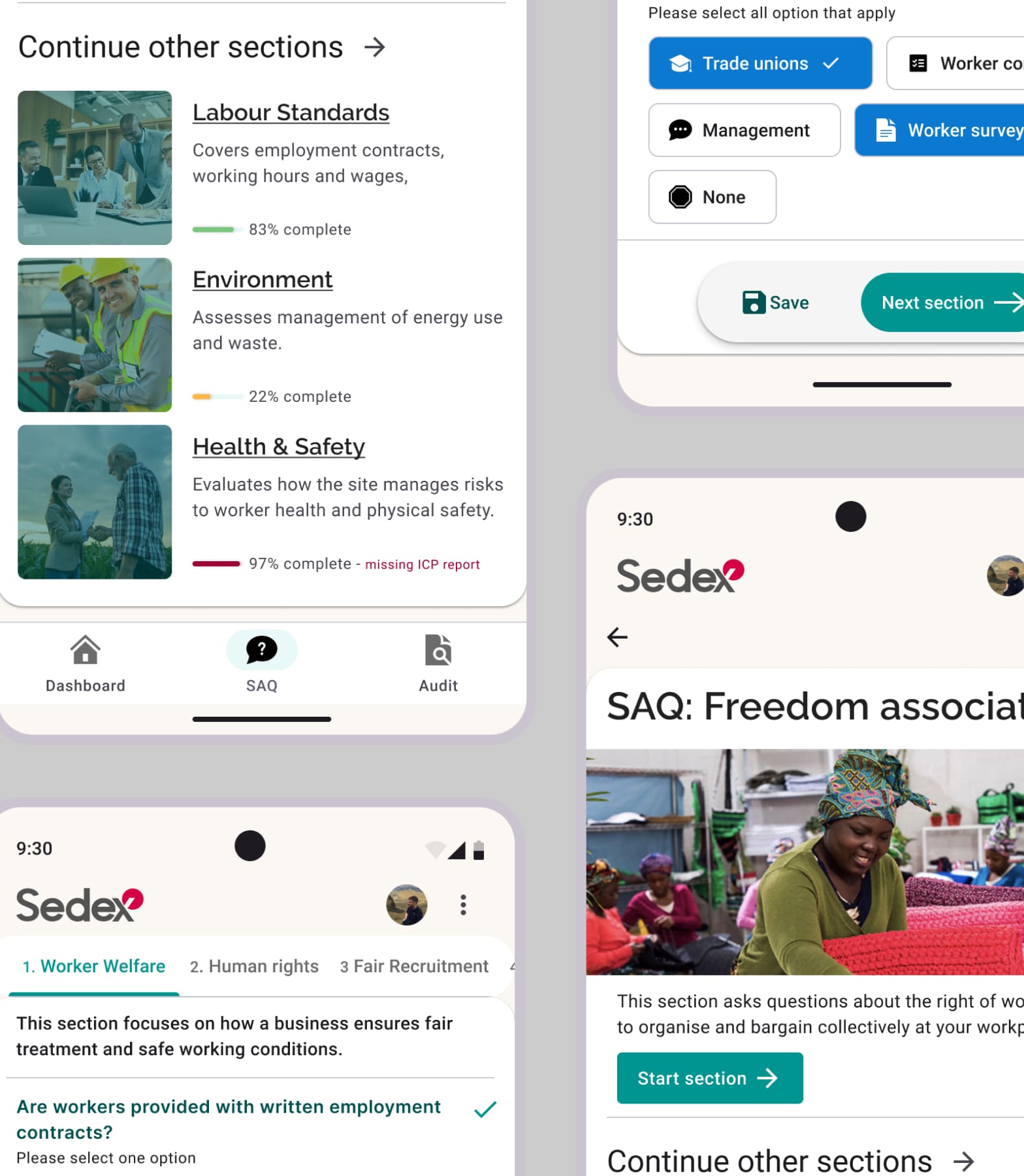
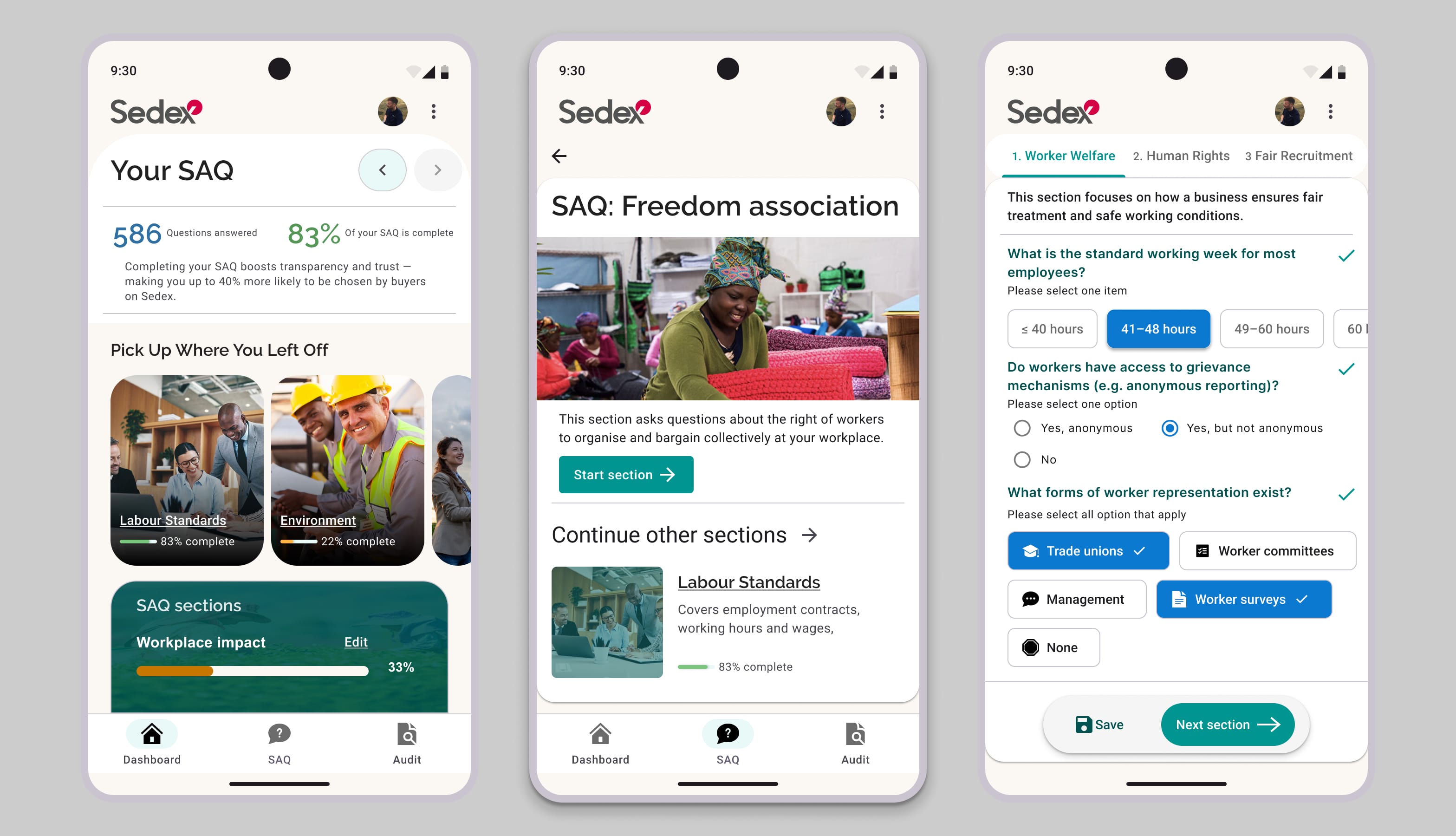
Screenshot of Fin AI Agent UI

πŸ“ Android App for Suppliers

We extended our design system to a native Android app, enabling suppliers to complete compliance questionnaires offline and sync data securely when online. Built with Jetpack Compose, it uses material components and mirrors our core system’s token structure, ensuring a consistent experience across web and mobile.
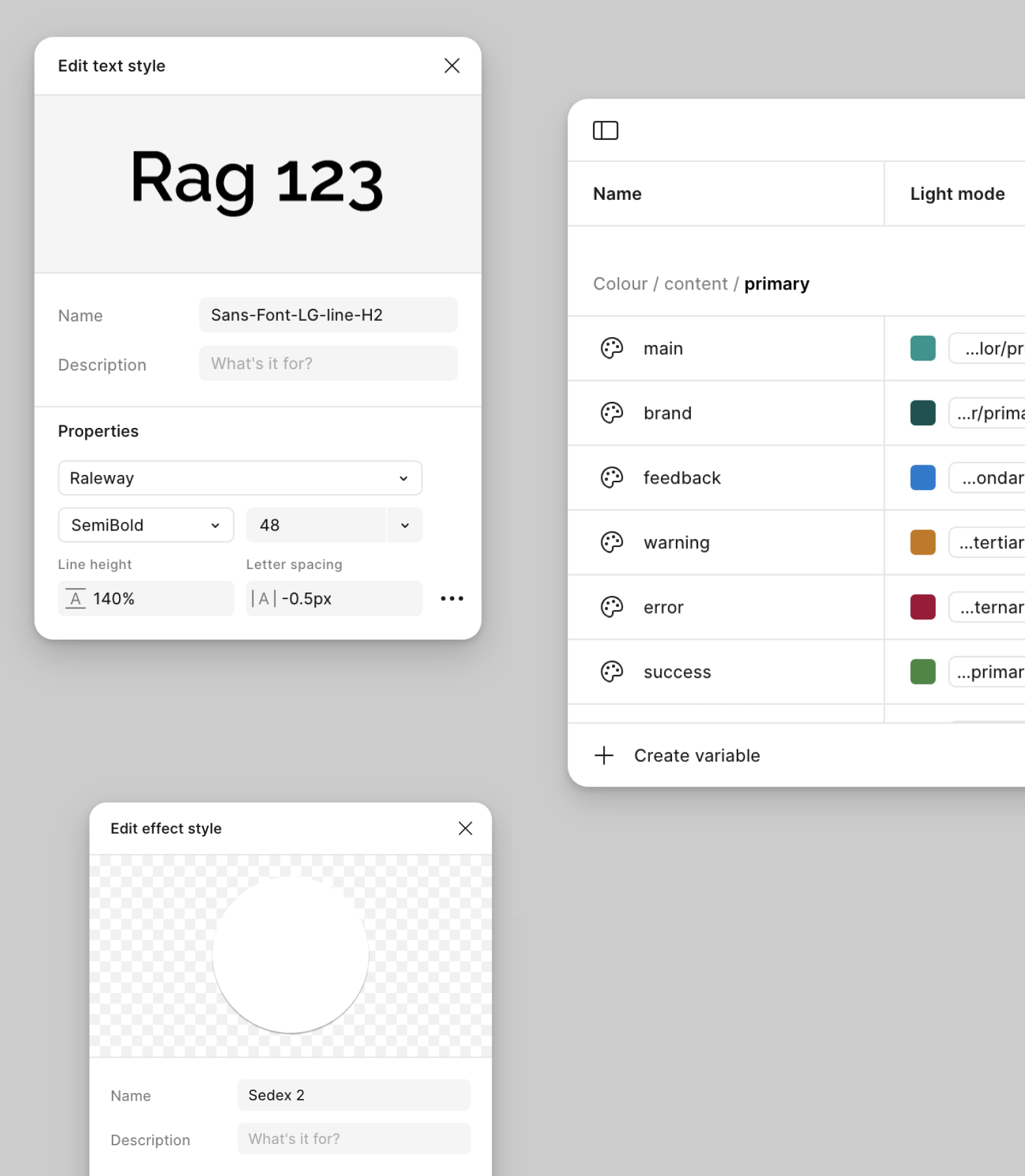
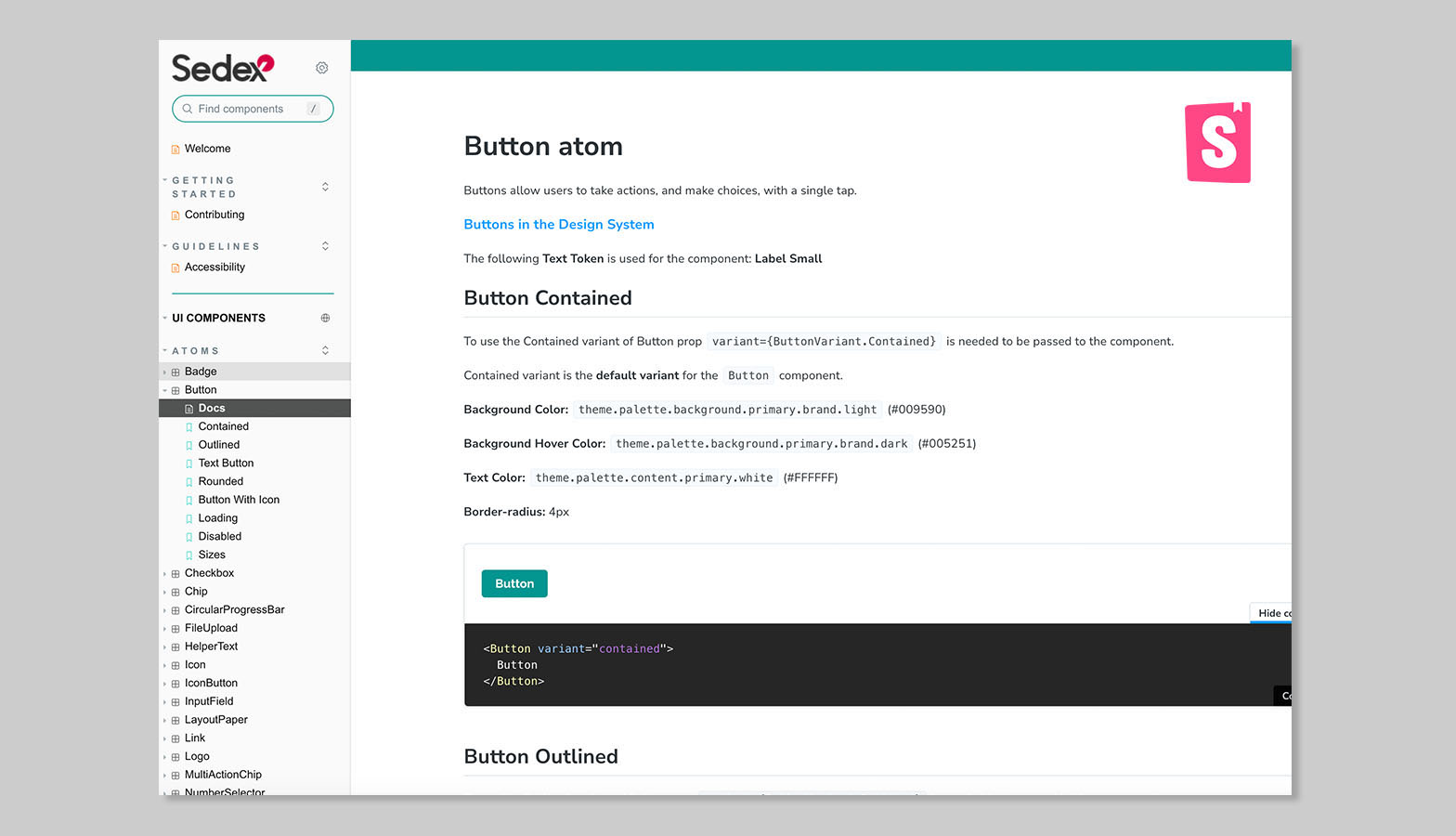
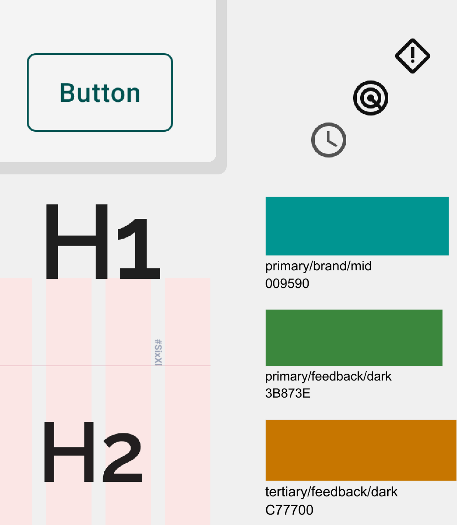
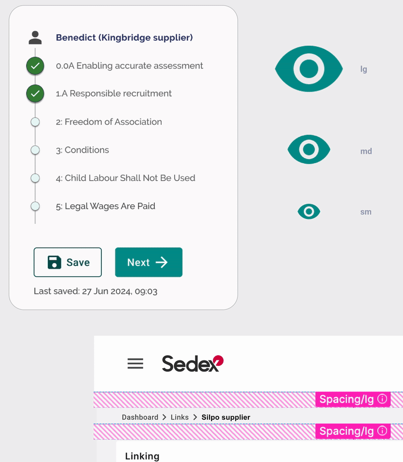
Screenshot of Fin AI Reporting Dashboard

πŸ“ Design Tokens in Figma Variables

I leveraged Figma variables to manage tokens for colour, spacing, type, and radius and creating a shared source of truth. Developers mapped tokens across web and Android for consistent, efficient builds. If I were approaching the project again, I’d take a more structured approach and make fuller use of token studio to manage them more effectively.

Project Title
AndroidApp

πŸ‘₯ Collaboration with the Front-End Development Team

Collaborated closely with the front-end team, using retros and Jira to shape development. Storybook supported reusable components, while design tokens enabled seamless global updates. Embedded Figma guidelines ensured shared understanding across teams.

Final File

https://design-system.fe-dev.sedexconnect.com/?path=/docs/welcome--docs

πŸ‘¨β€πŸ’» The platform

The platform's consistency improved steadily as squads integrated the new design system into their workflow and development process. Thanks to the design system, the platform is now responsive, providing an excellent foundation for a mobile-first app approach.

Set guidelines for transitions
Example of individual component interactions

πŸ“Š Outcome & Impact

Page load times for core application areas improved by 27% after implementing the new component system, thanks to cleaner, token-driven front-end code. Source: CTO, All hands meeting

"The new design feels much more modern and easier to use β€” members aren’t calling us confused anymore. They no longer feel like they are jumping around in the experience." Source: Member Services Team Lead, post-launch feedback

πŸ‘¨β€πŸ’» The Next Steps: From Foundation to Future

Building upon this foundation, the next phase involved envisioning the future of the platform with the whole product team, leveraging the newfound ease with which component styling could be adjusted and shipped.

Project Title
The next phase: Mobile first and dark mode
A new look for Heist β†’